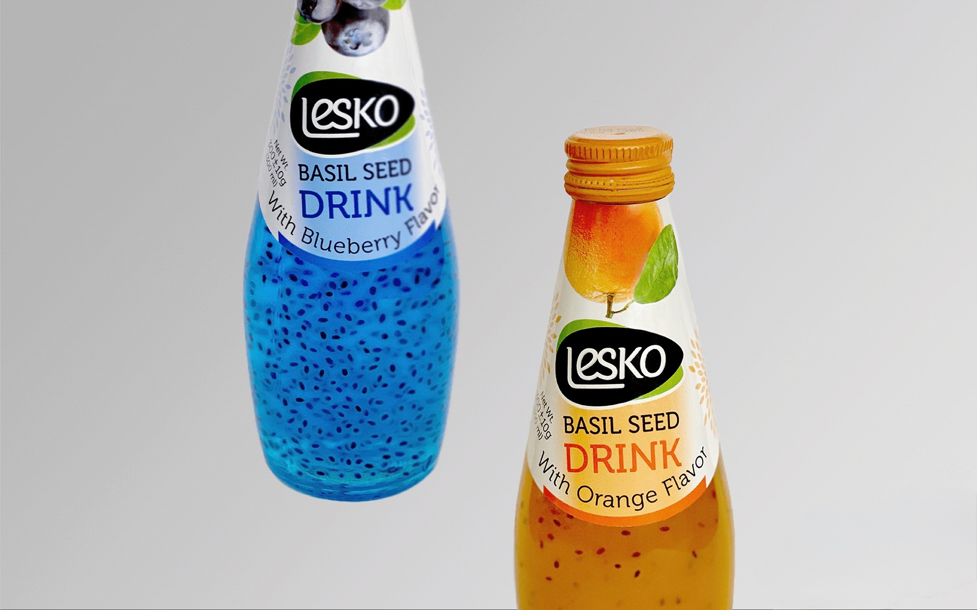



Lesko is a basil seed drink brand with a wide range of fruit flavours.
I designed the logo and complete label system, creating an identity that could stay recognizable across the full product line while giving each flavour its own personality.
The final designs moved beyond the concept stage: the labels were produced and used on Lesko bottles sold in stores.
I wanted the bottles to feel fresh, colourful, and easy to recognize on a crowded shelf.
Since the basil seeds were already visible inside the drink, I kept the packaging structure simple and used the liquid, cap, fruit imagery, and flavour typography to make each option distinct.

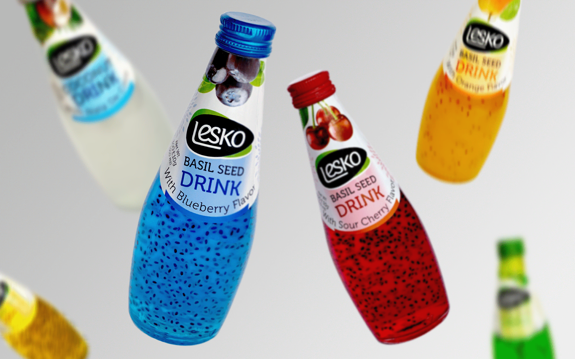
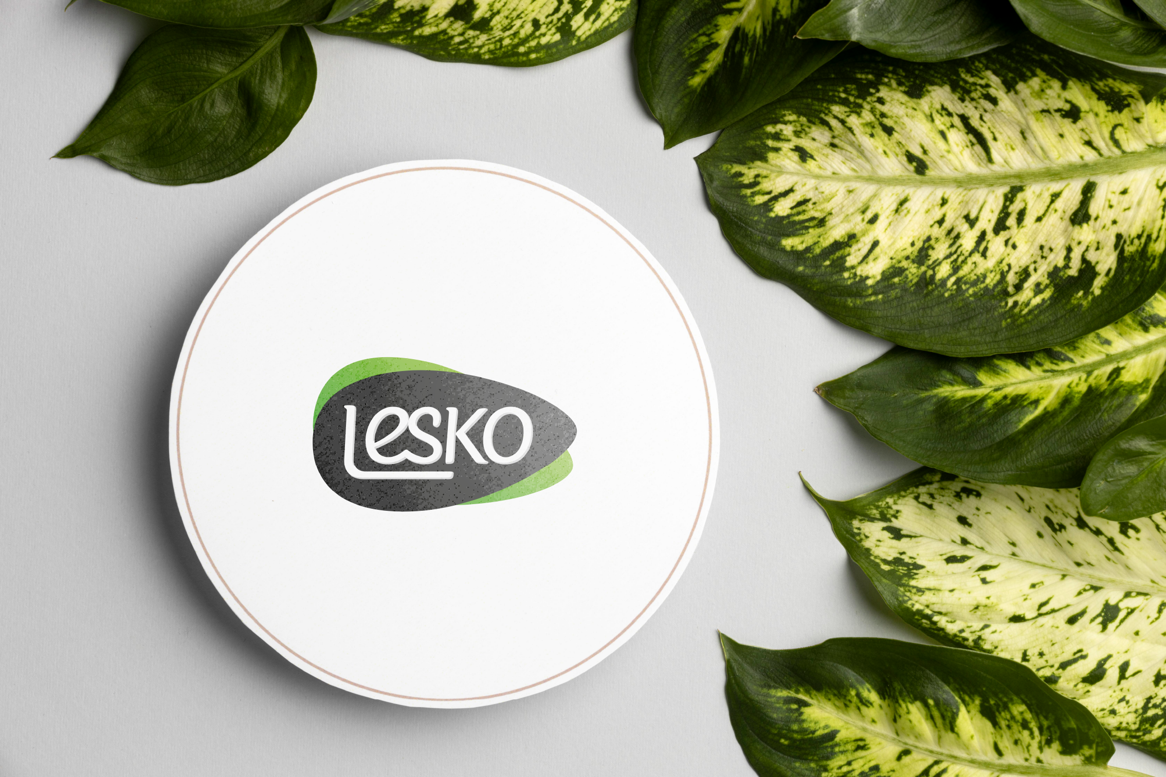
The logo combines the organic shape of a basil seed with a small green leaf.
The black seed shape gives the identity a bold and recognizable silhouette, while the leaf adds a simple cue of freshness. I also created English and Persian versions of the wordmark for use across the packaging.
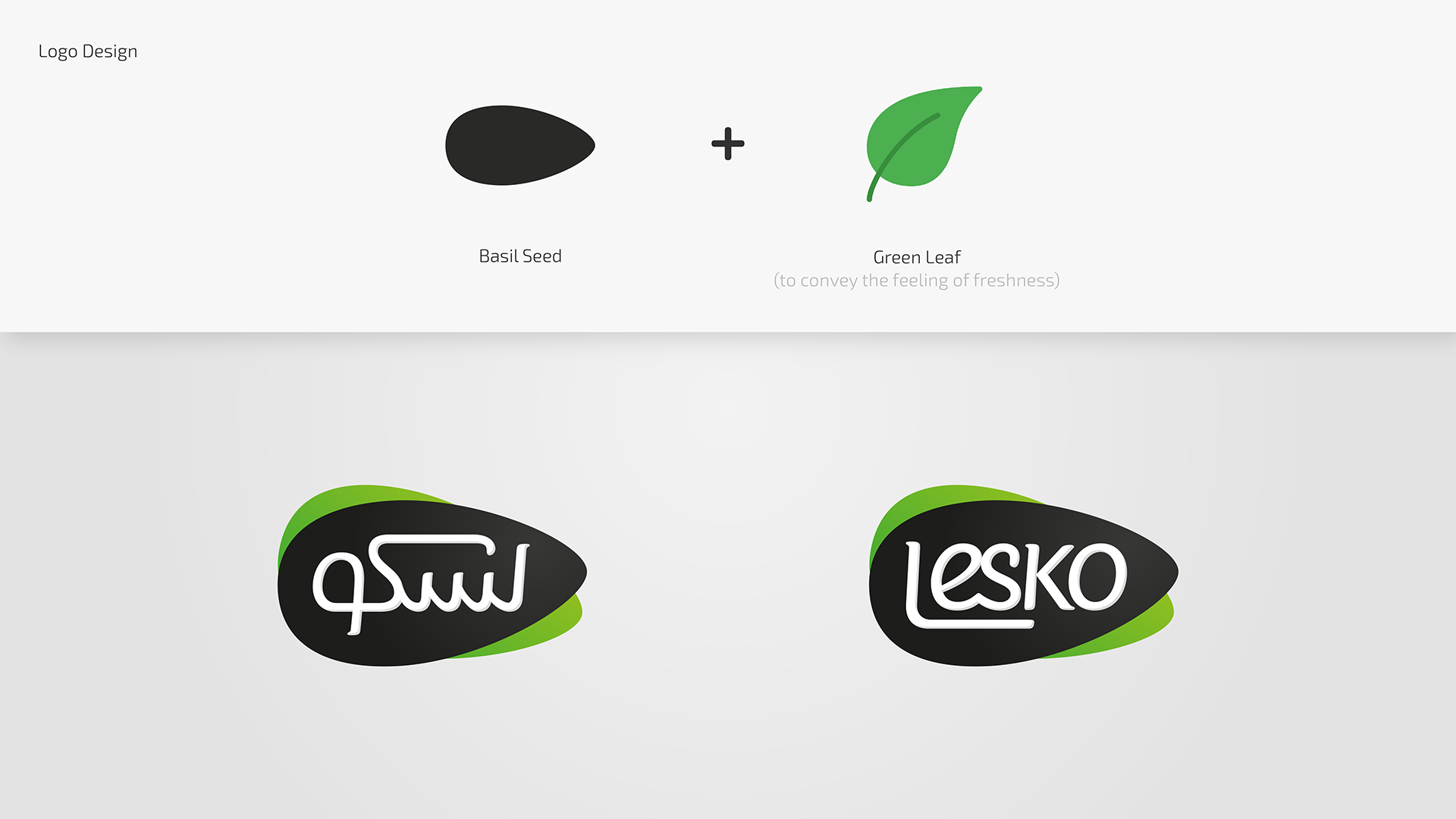
I explored overlapping organic forms before arriving at the final logo.
Instead of using a perfectly geometric shape, I kept the outline slightly irregular to reflect the natural form of a real basil seed.

The identity uses a black seed-shaped mark, white lettering, and a bright green accent.
Keeping the main logo palette restrained allowed the fruit photography, flavour names, liquid colours, and bottle caps to change without making the product family feel disconnected.
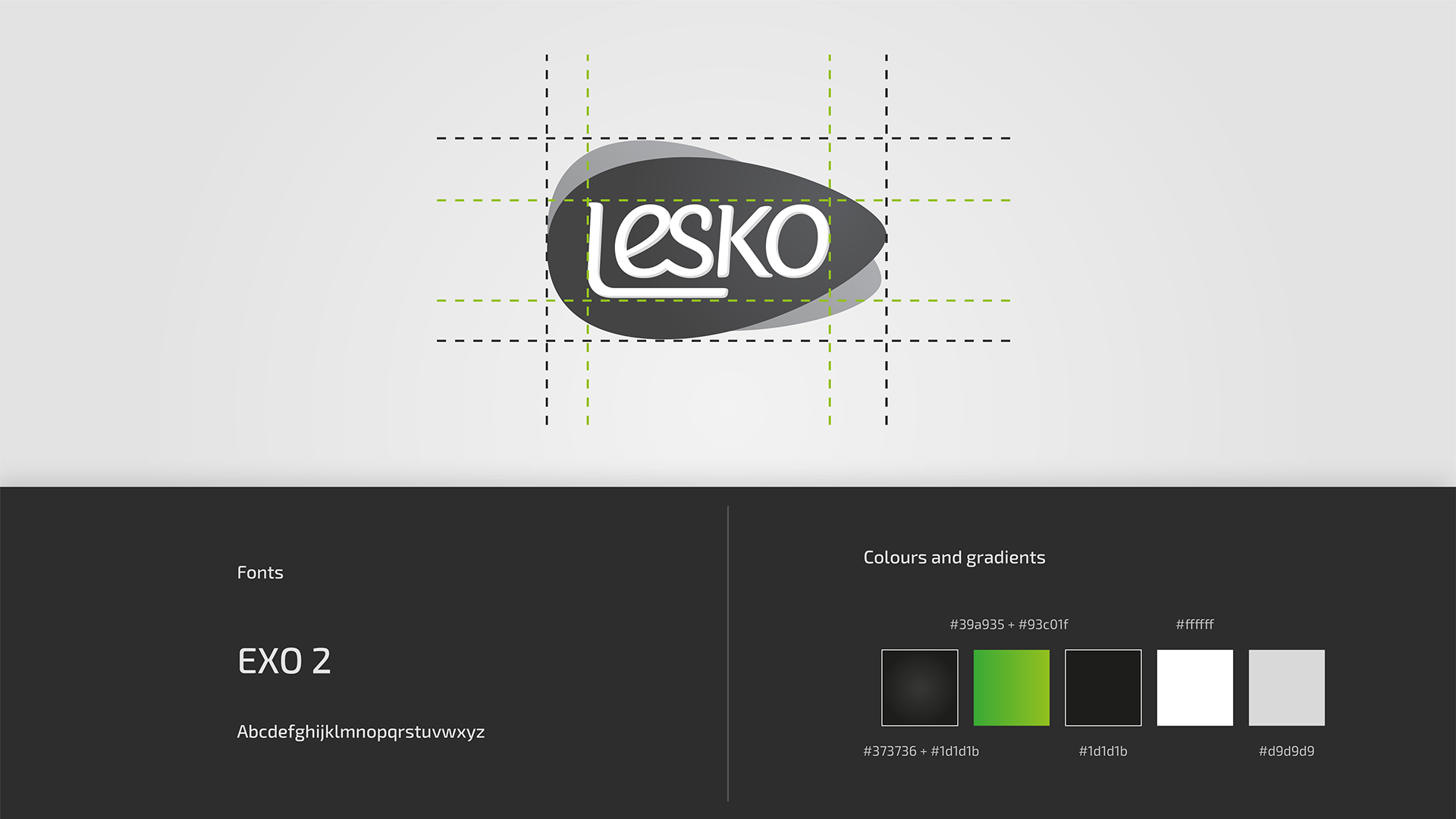
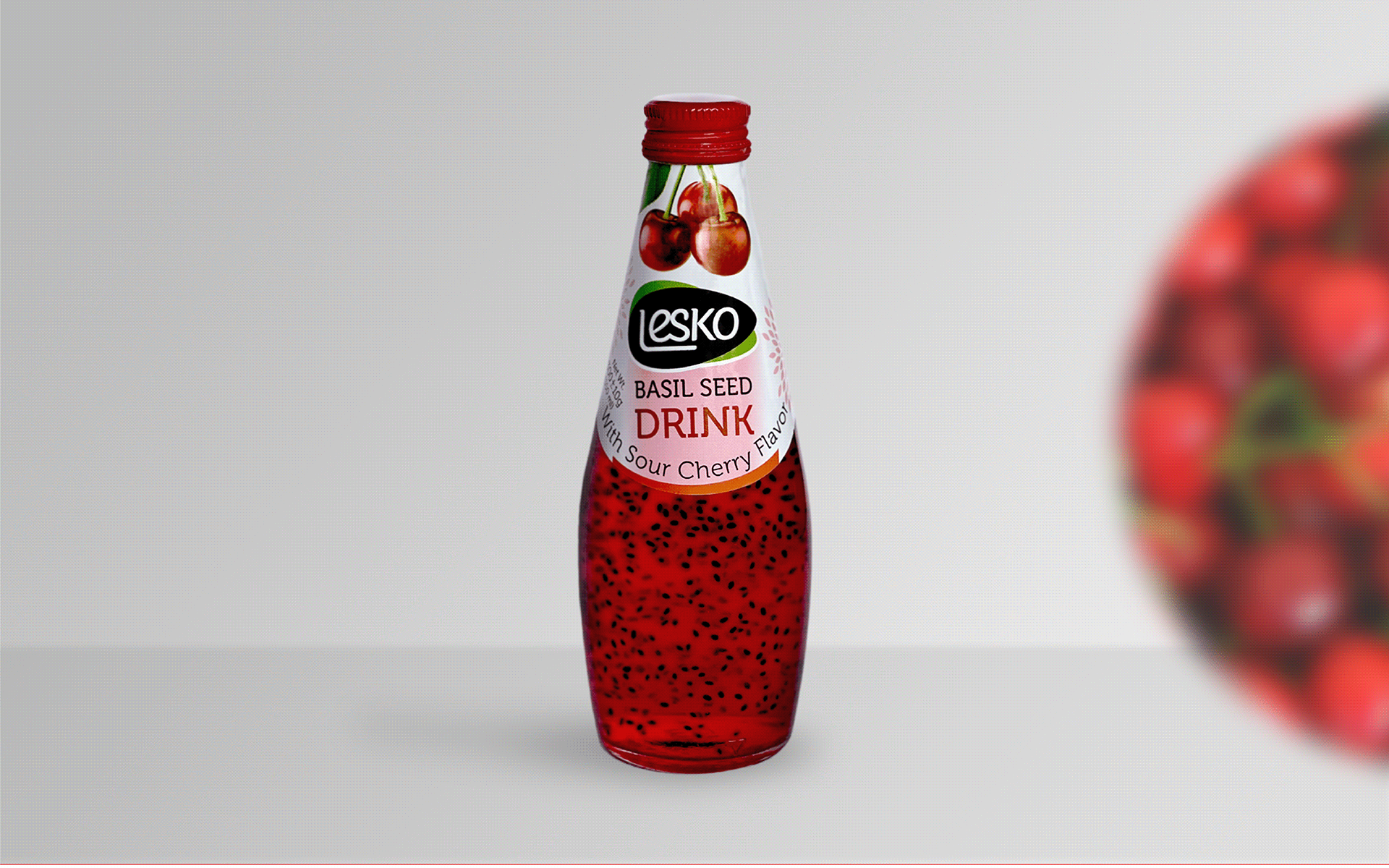
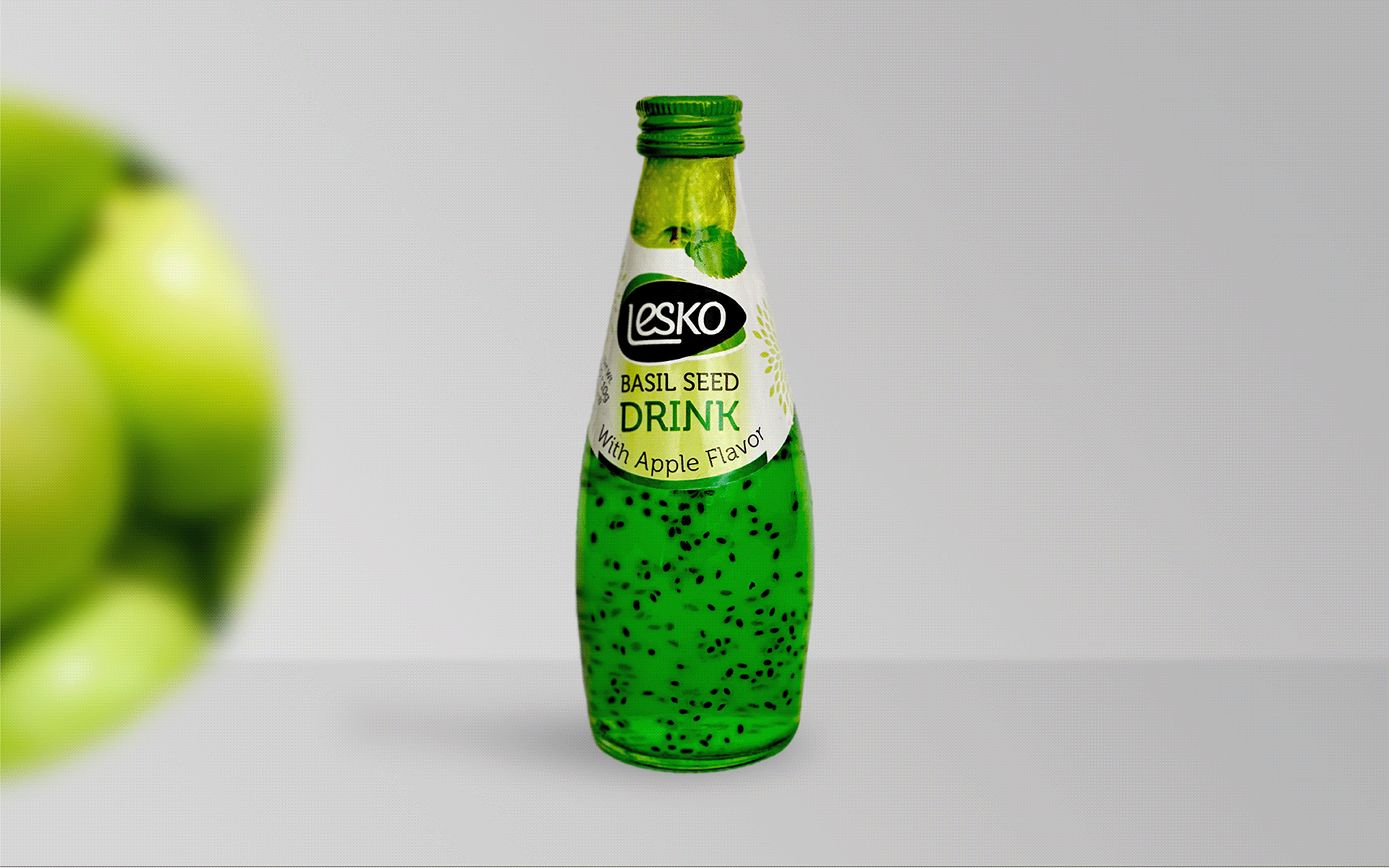
Each flavour follows the same label structure while changing its fruit imagery, accent colour, and flavour name.
The white base creates contrast against the colourful drink, while the curved label follows the bottle’s shape. Large flavour names make the options easier to recognize when displayed together in stores.
I designed the complete wraparound labels, including the front-facing identity, flavour information, ingredients, nutrition details, barcode, and production information.
The same system was adapted across the full product range, keeping the hierarchy and layout consistent while allowing each flavour to feel different.
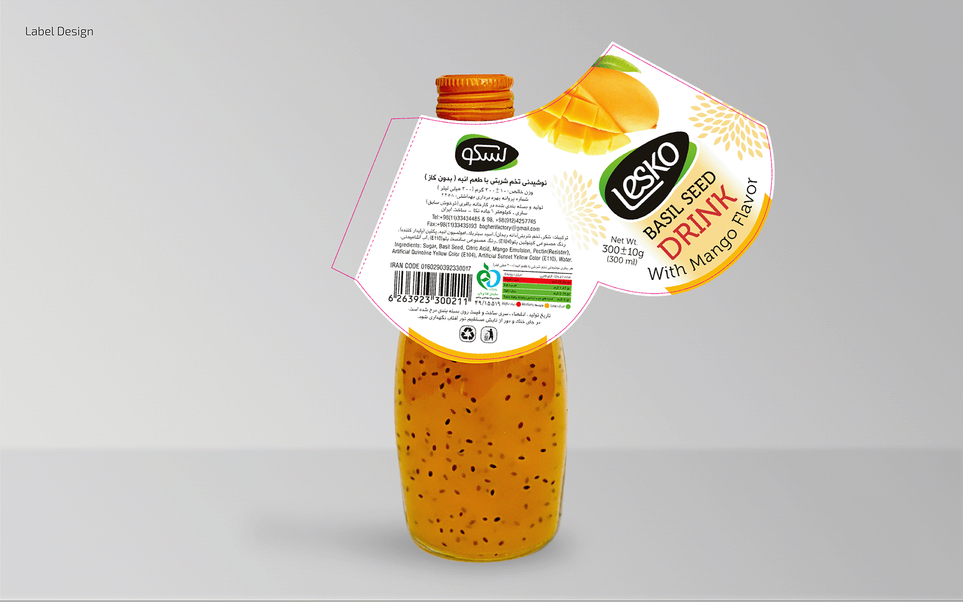
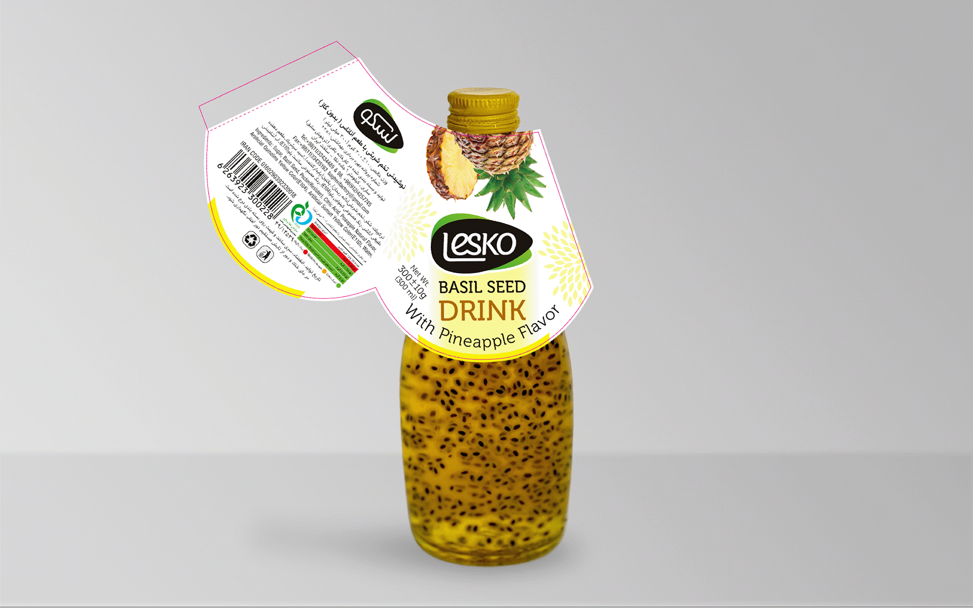
The final labels were produced and applied to the commercial Lesko drink collection.
Seeing the identity move from early logo sketches to real bottles in stores made this project especially meaningful. It showed how a simple, flexible visual system could support many flavours while still creating one recognizable brand on the shelf.
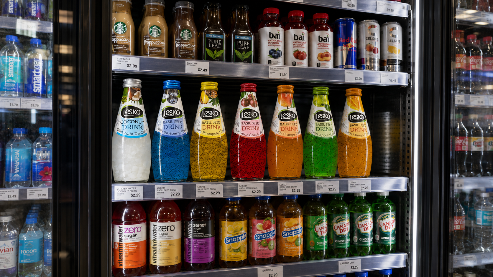
Each bottle has its own flavour, colour, and fruit identity, but the shared logo, label shape, typography, and composition keep the collection connected.
The final result is a bright and playful product family designed to feel fresh, recognizable, and full of flavour.