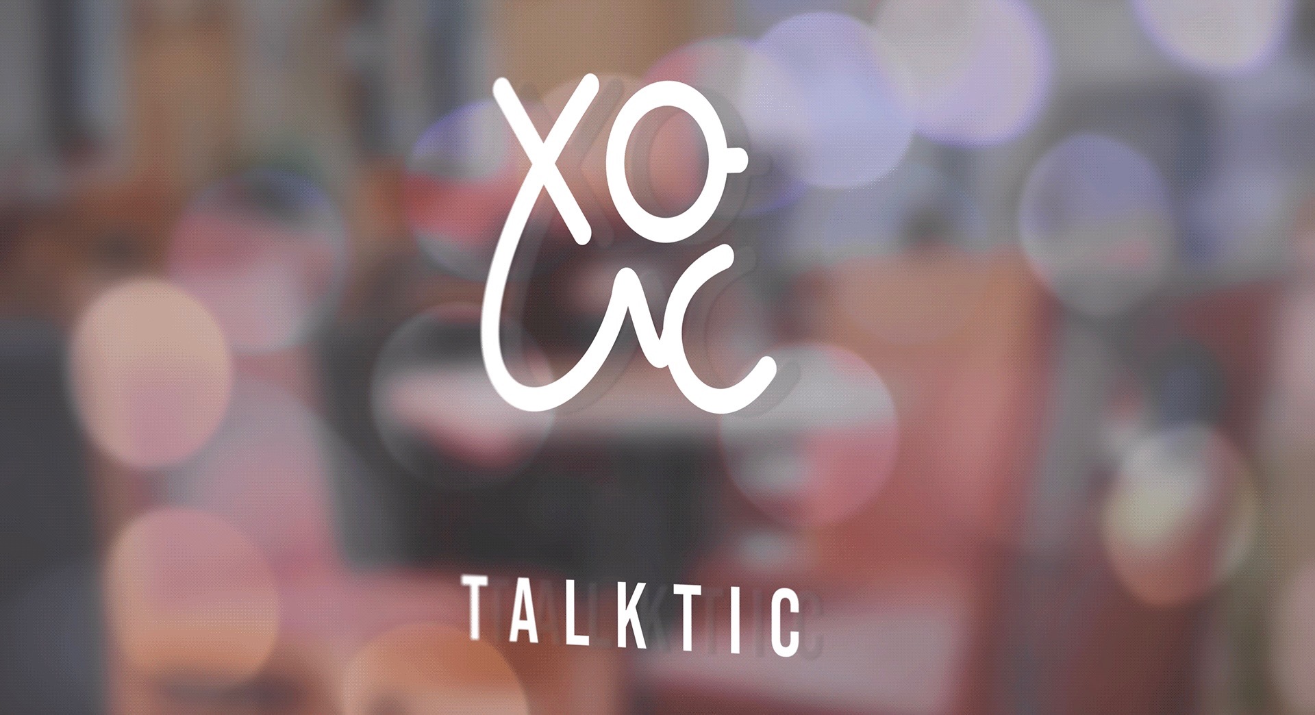

Talktic is a board game café in Tehran created around games, conversation, and spending time together.
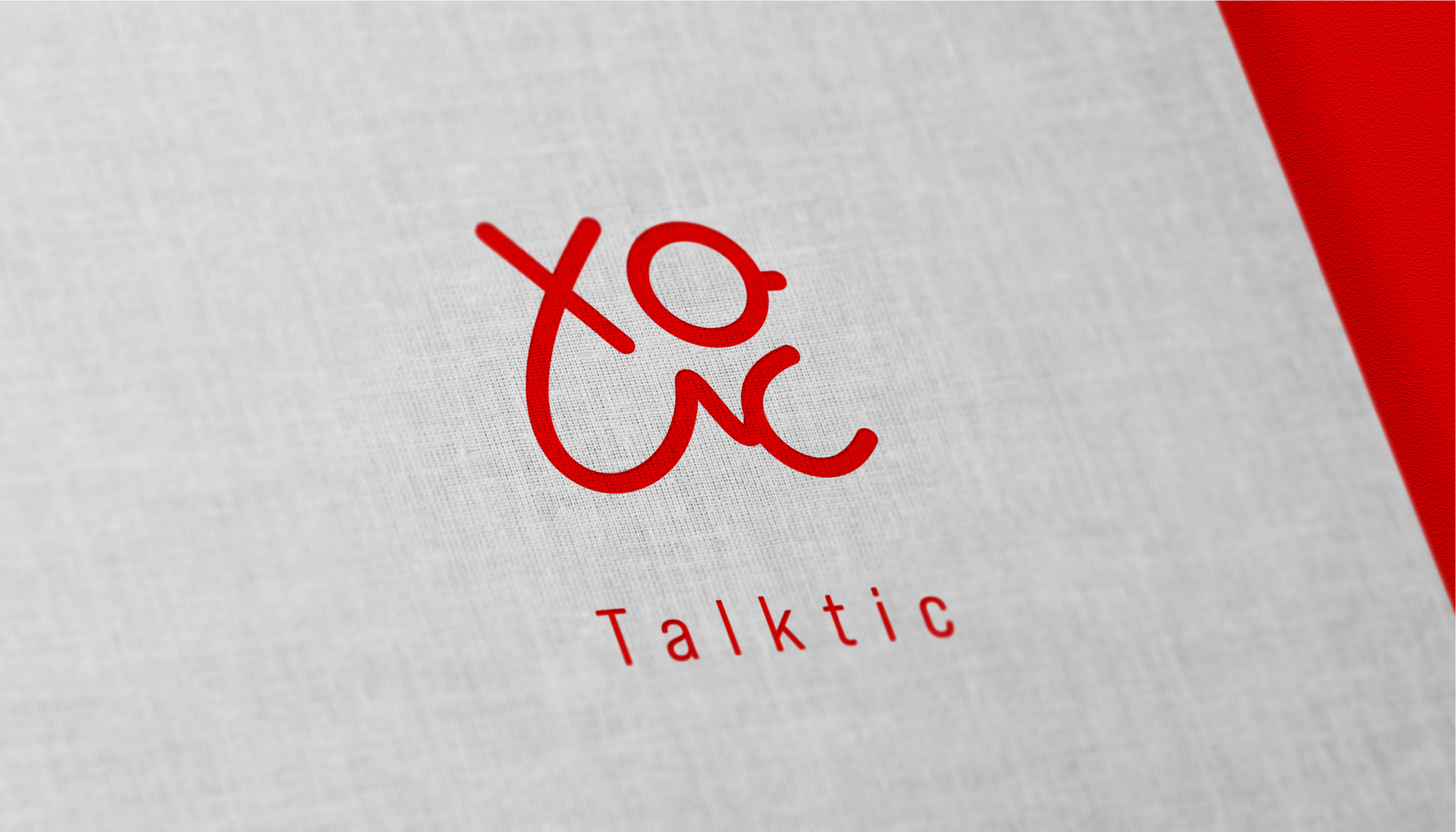
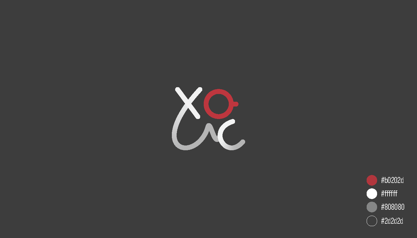
I designed a flexible identity that combines familiar X and O symbols, a heart-like gesture, and the shape of a coffee cup. The final mark uses a minimal red, charcoal, and grey palette that could work across café signage, printed materials, and social media.
The identity needed to communicate more than board games alone.
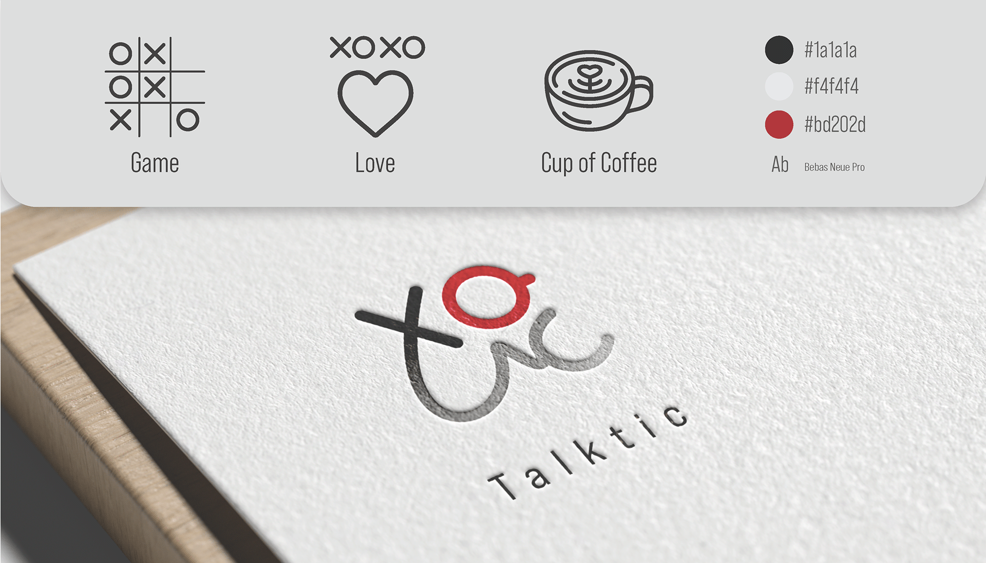
I brought together three parts of the café experience:
Game through the familiar X and O symbols
Connection through the visual language of love and togetherness
Coffee through the rounded cup-like form inside the mark
The result is one flowing symbol that feels social, playful, and easy to recognize.
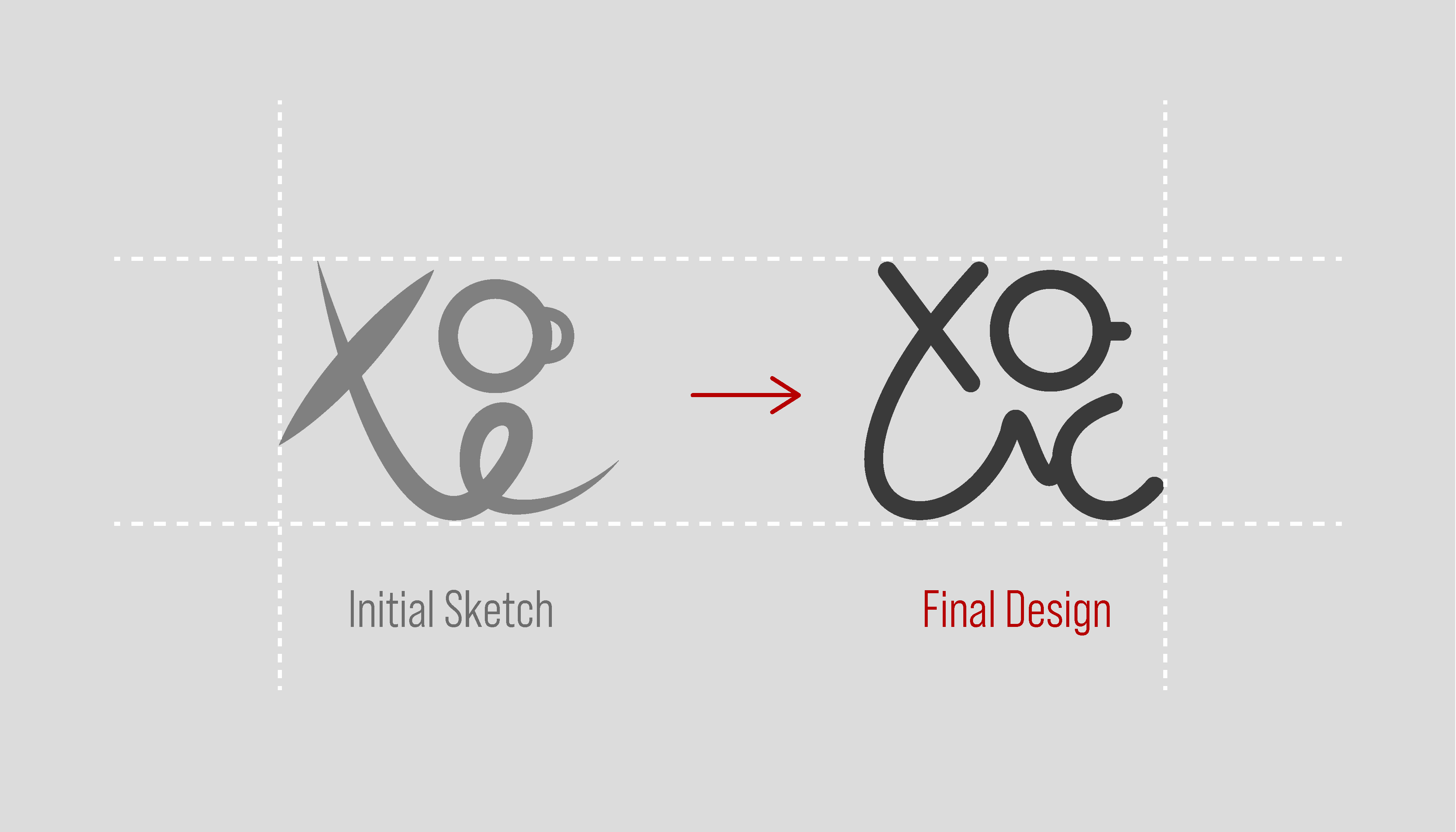
The early sketch had the main idea, but the shapes felt uneven and harder to read as one symbol.
I refined the curves, spacing, and proportions to make the mark cleaner while keeping the hand-drawn movement that gave it personality.
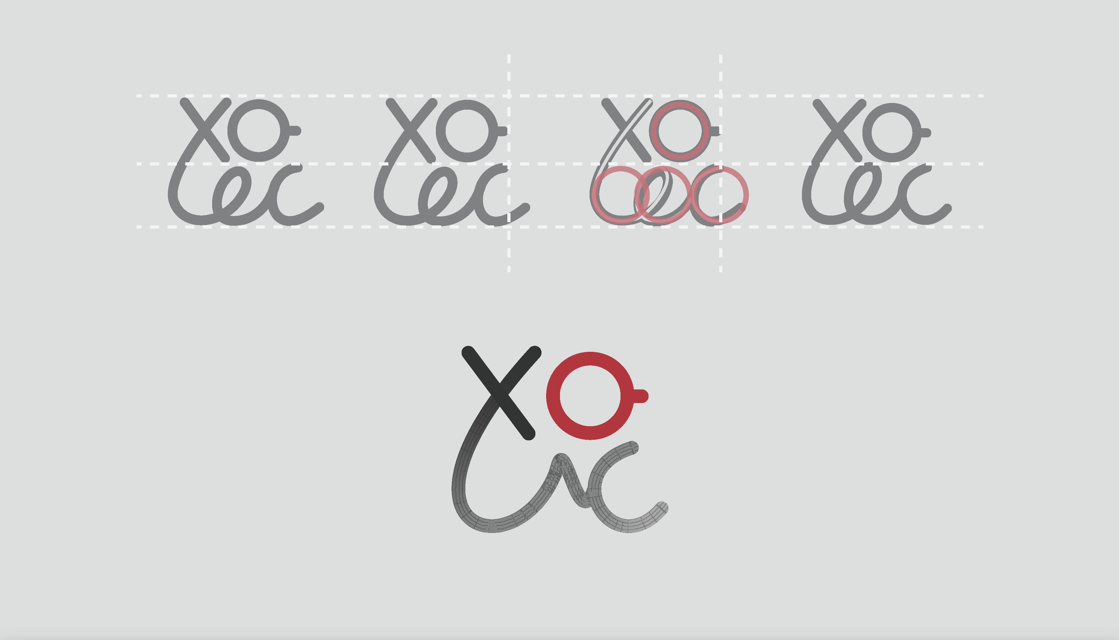
I tested different alignments and circle proportions to connect the individual letters and symbols more naturally.
The final version balances structured X and O forms with softer curves underneath, creating a mark that feels both game-related and conversational.
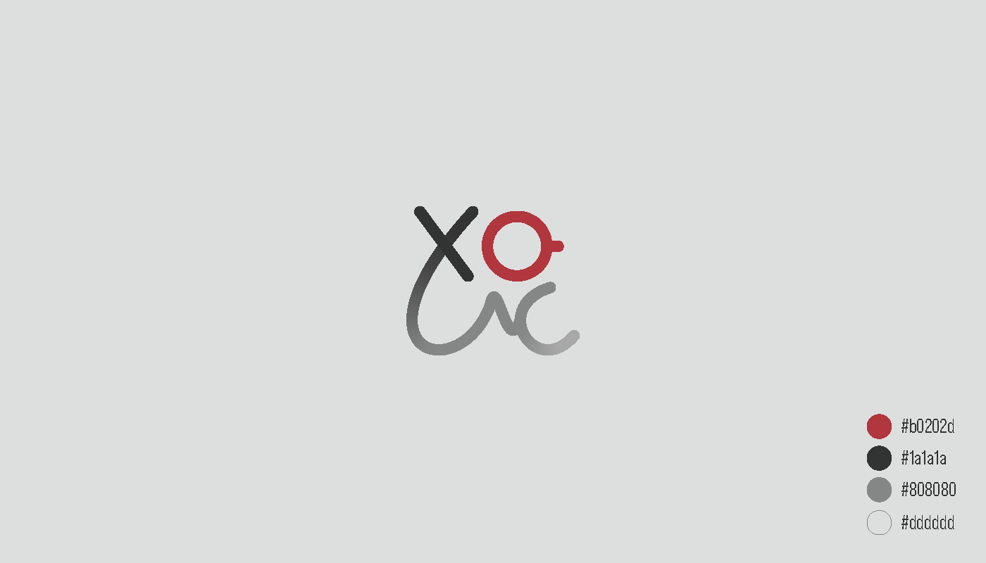
The final identity uses charcoal, soft grey, and a deep red accent.
Red draws attention to the coffee-cup-shaped O and adds warmth, while the neutral shades keep the identity flexible across light and dark applications. I paired the mark with Bebas Neue Pro for a narrow, modern wordmark that does not compete with the symbol.
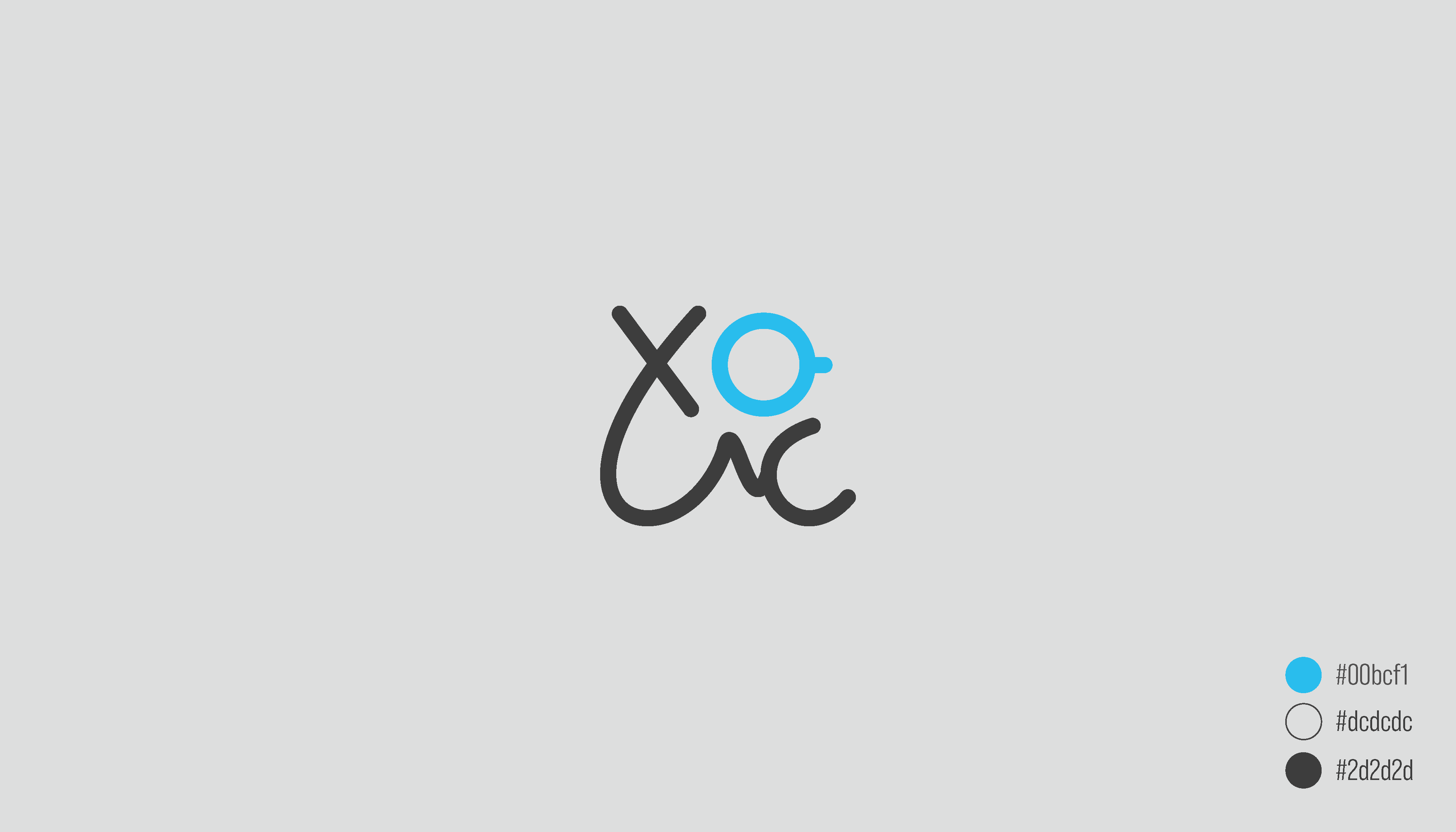
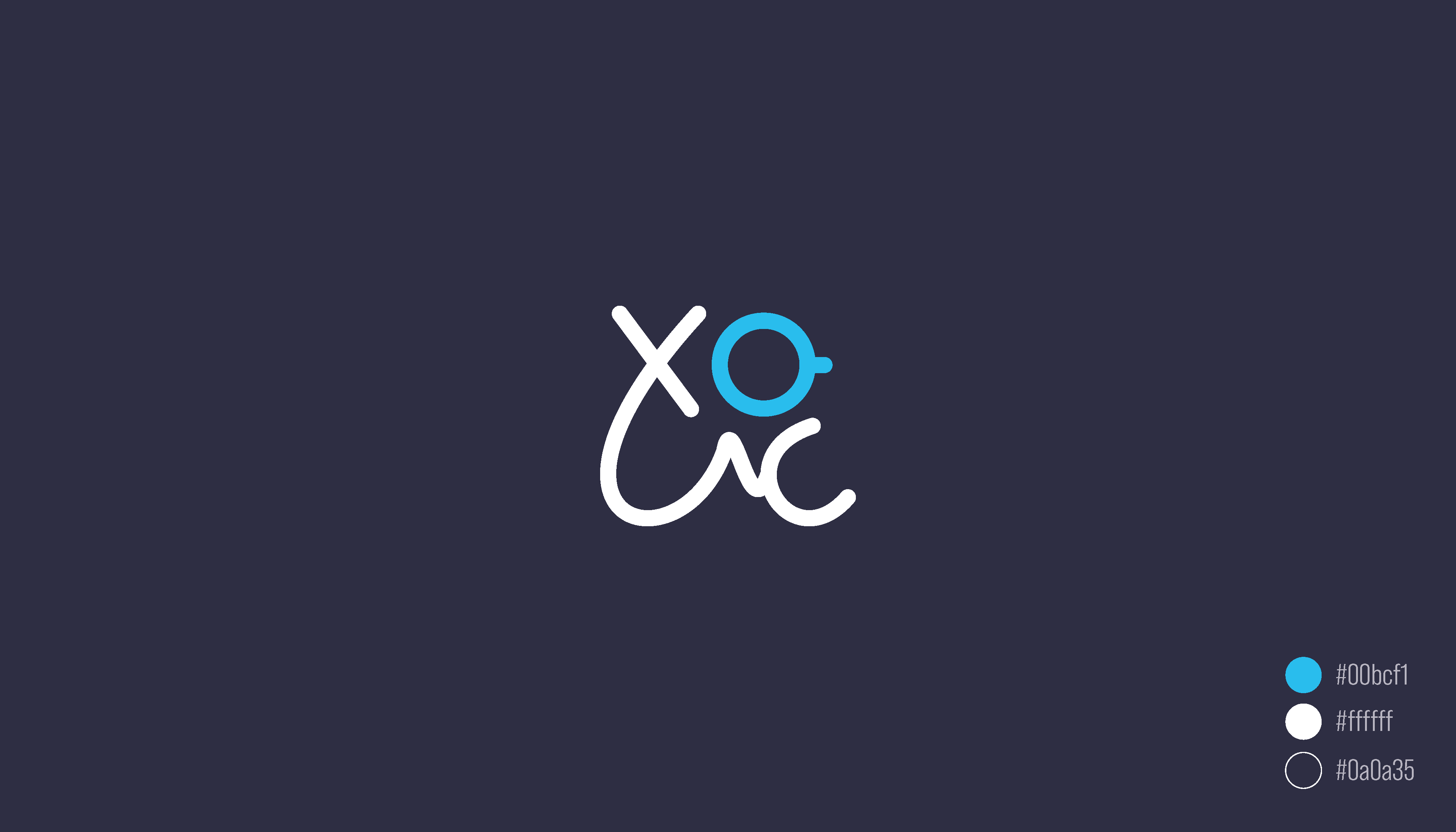
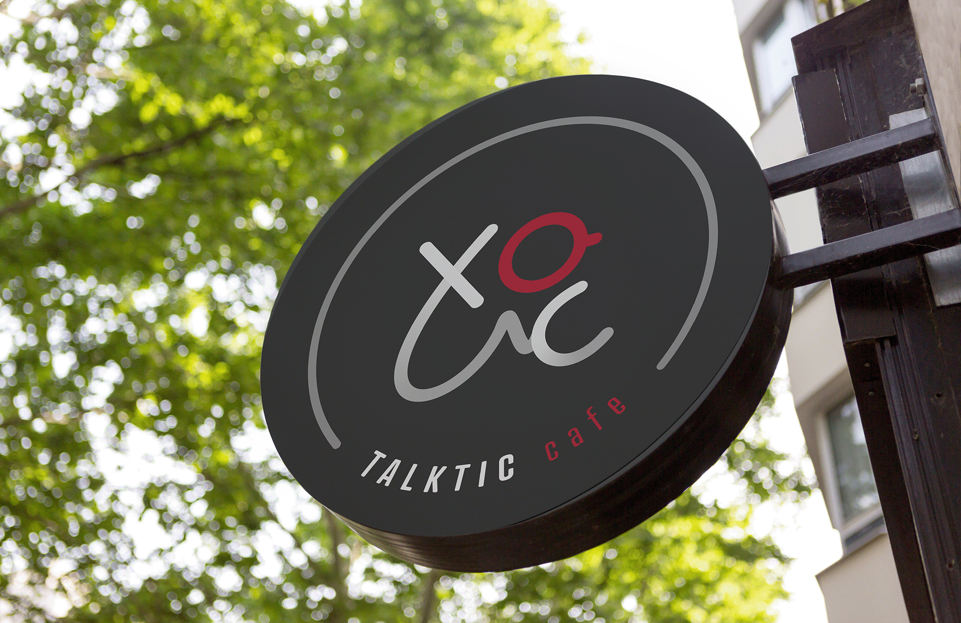
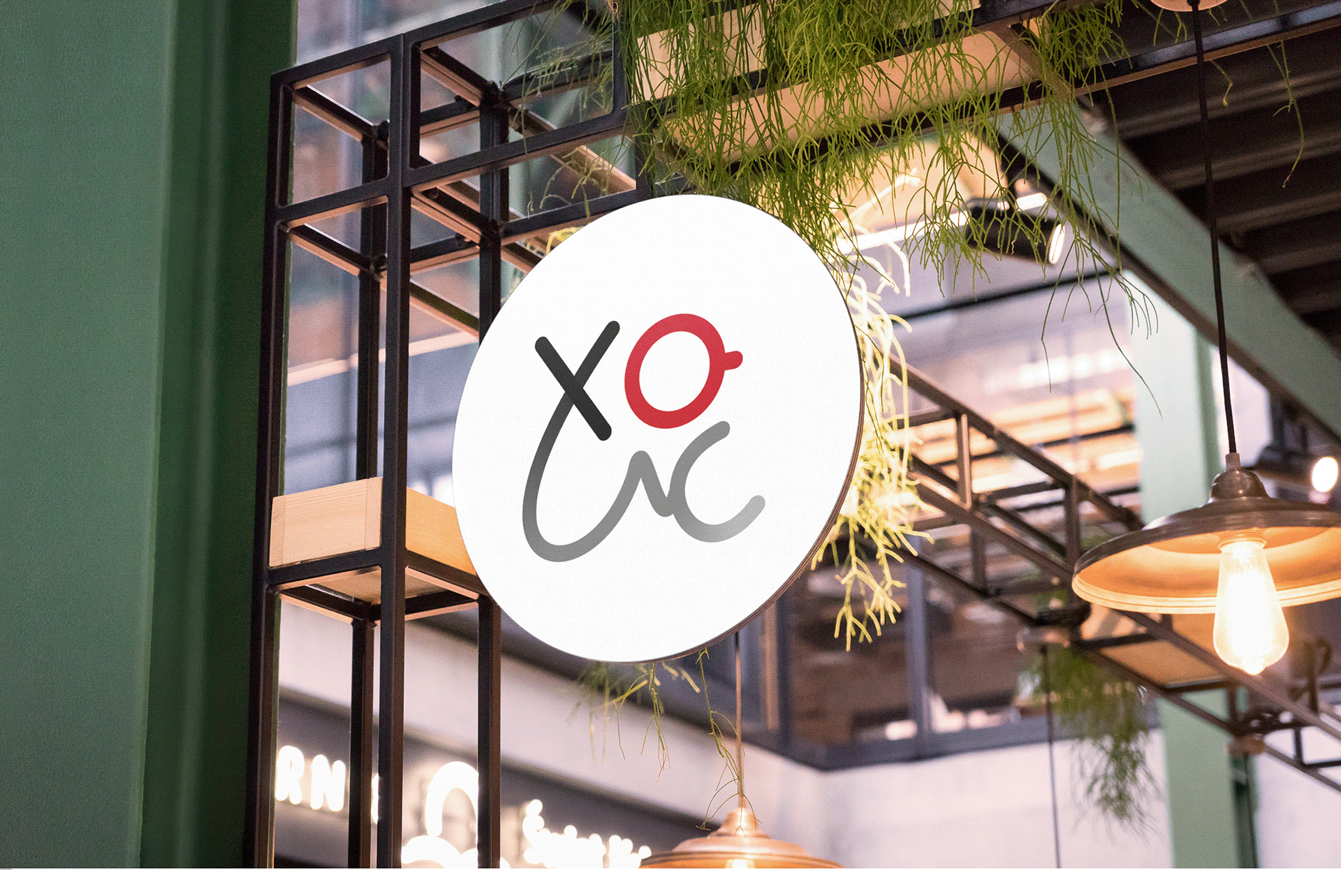
The symbol was designed to remain recognizable without the full wordmark, making it useful for large signs and compact environmental applications.
The circular sign gives the logo a strong presence inside the café, while the darker exterior version creates enough contrast to stay visible from the street.
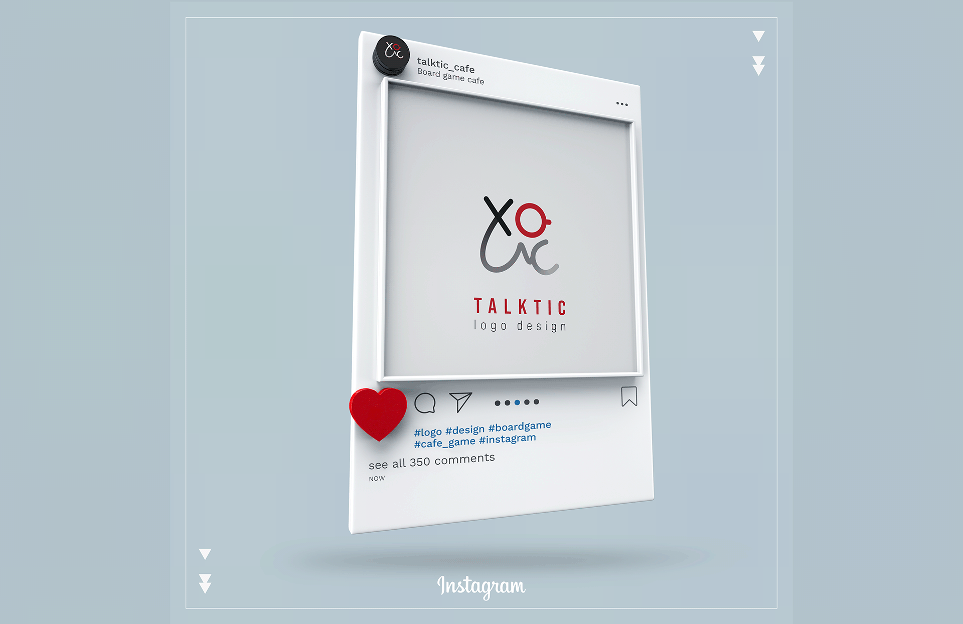
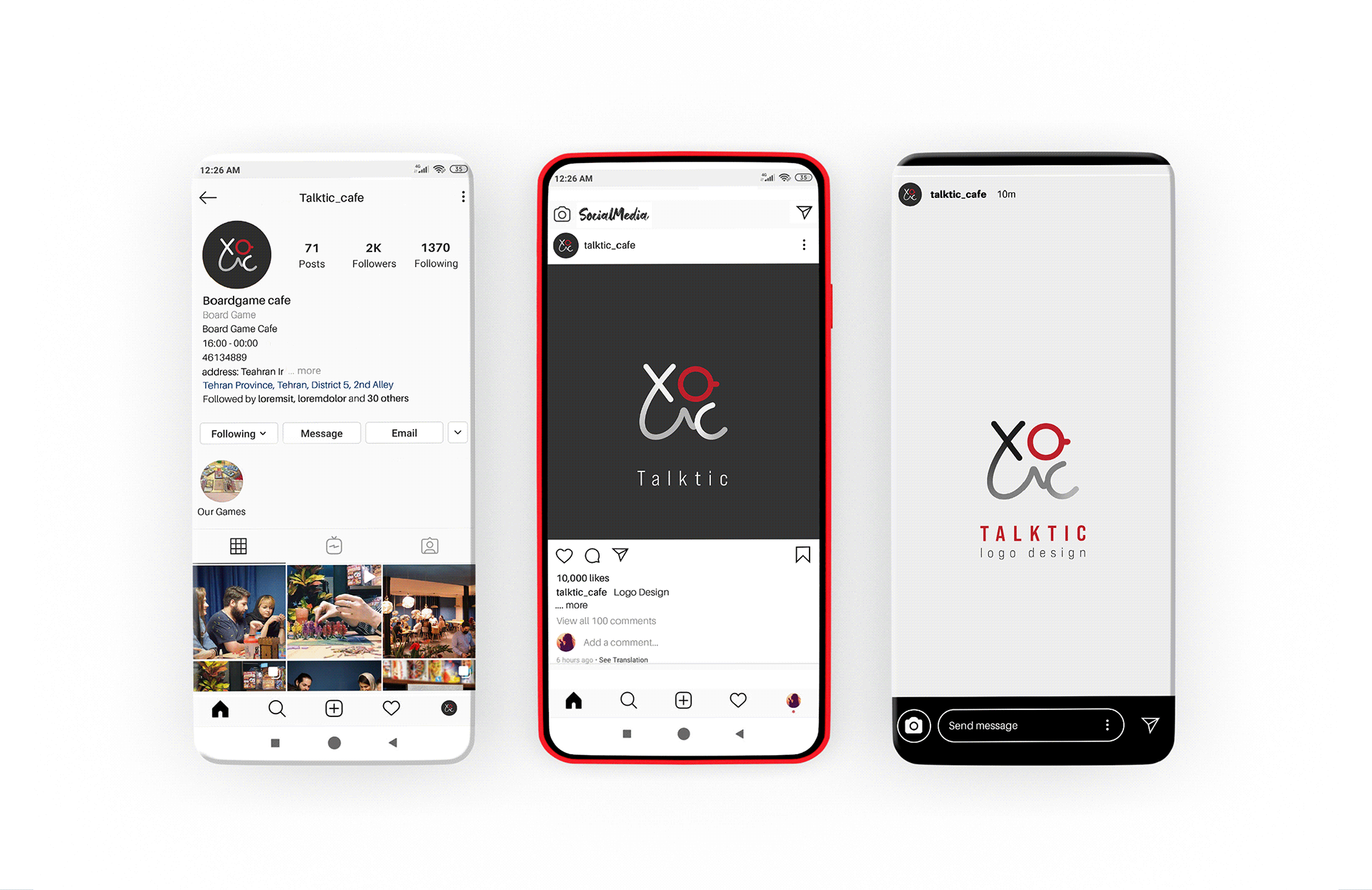
I adapted the logo for Talktic’s social profiles, posts, and stories.
The compact mark works well as a profile image, while the restrained palette keeps the café’s photography and content at the centre of the page.
The final logo brings the experience of Talktic into one simple mark: playing together, connecting with people, and sharing coffee.
Its combination of structured symbols and hand-drawn curves gives the café an identity that feels playful without becoming childish.