
Peek A Boo is a surprise-box experience designed to help groups connect. Each reveal leads to a riddle or collaborative challenge, giving people an easy reason to talk beyond their usual circles.
Our persona was Antoni, a professor at Emily Carr who wanted his Foundation students to connect beyond their usual friend groups. Each activity gives participants a reason to communicate, collaborate and learn something new about one another.
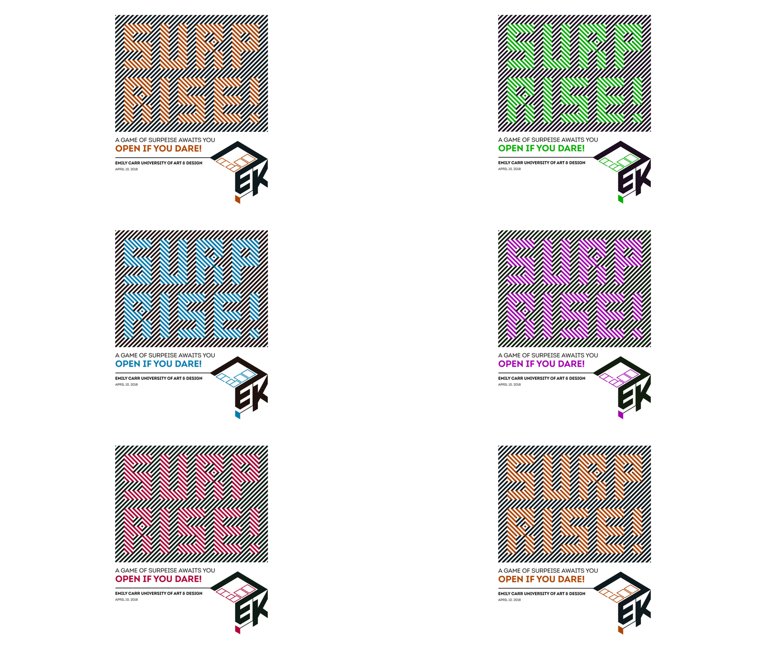
The main emotion behind the project was surprise. We carried that idea throughout the experience, from the activities inside the game to the logo, posters and colourful box design. My role in the group focused on creating the visual identity, packaging and promotional poster.
I explored how the feeling of surprise could begin before the box was even opened.
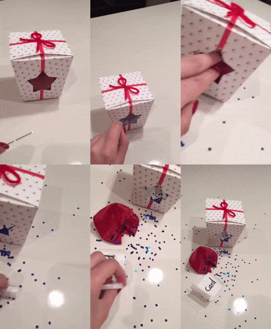
Hidden balloons turn opening the box into the first shared activity. Participants pop them to uncover the surprises inside.
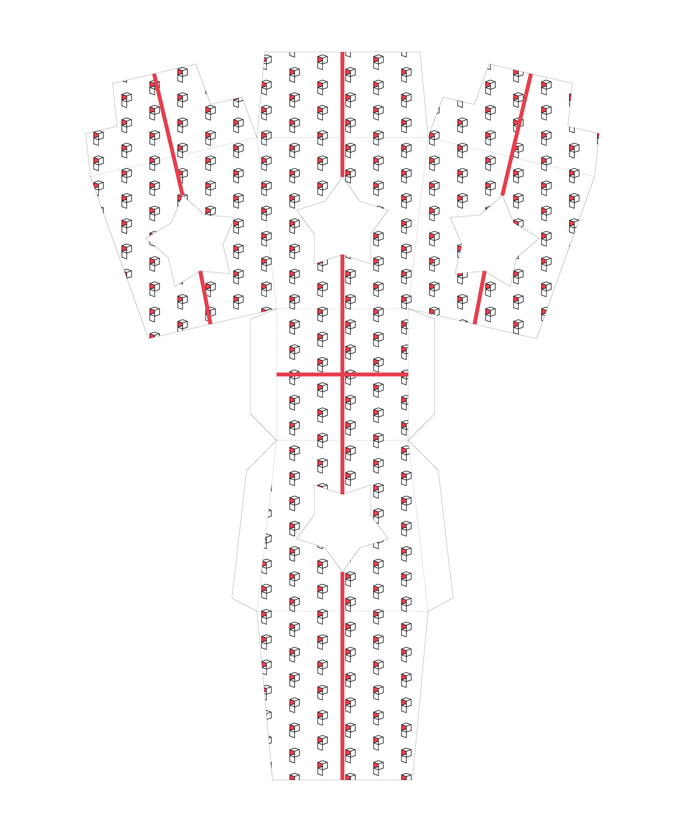
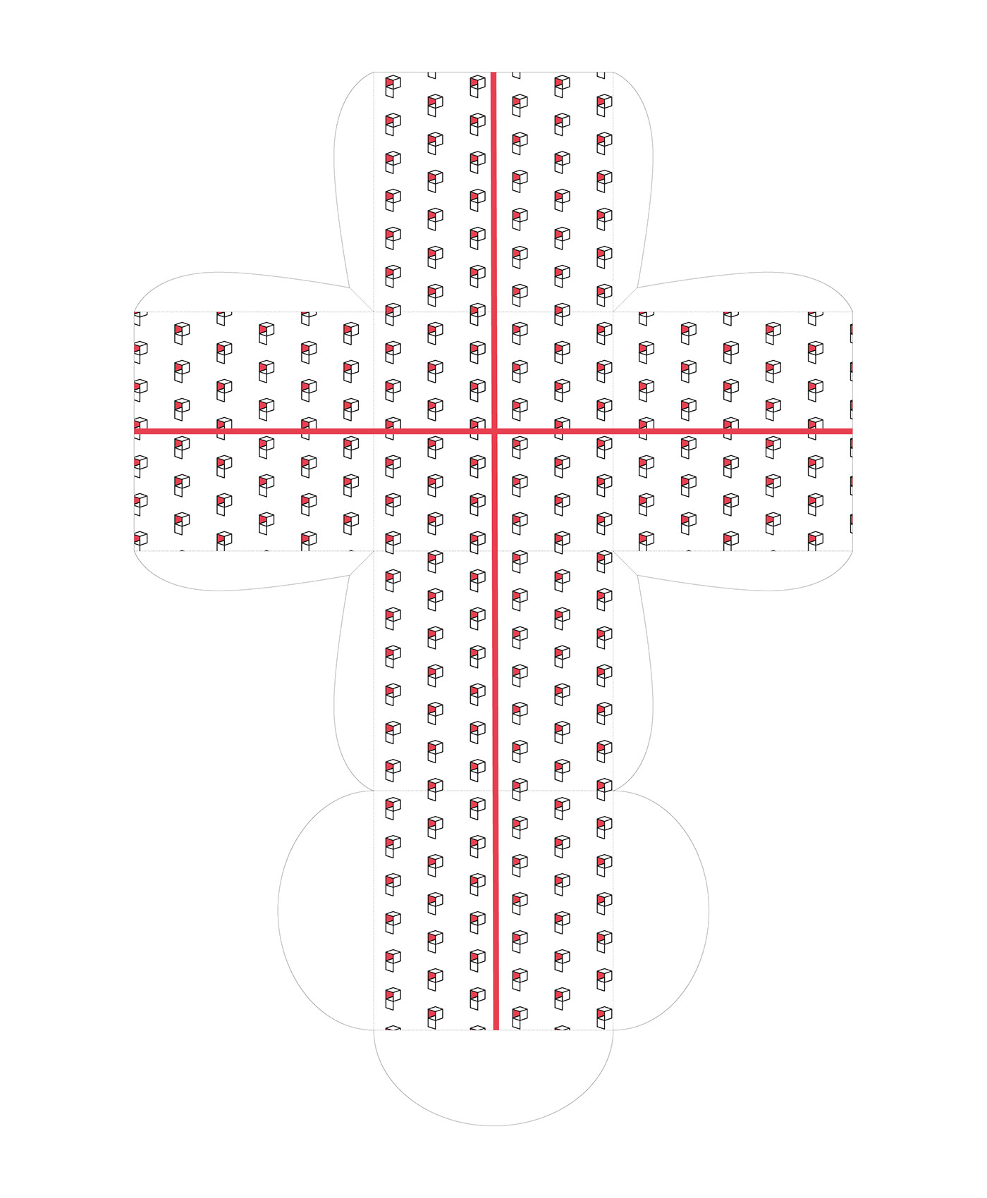
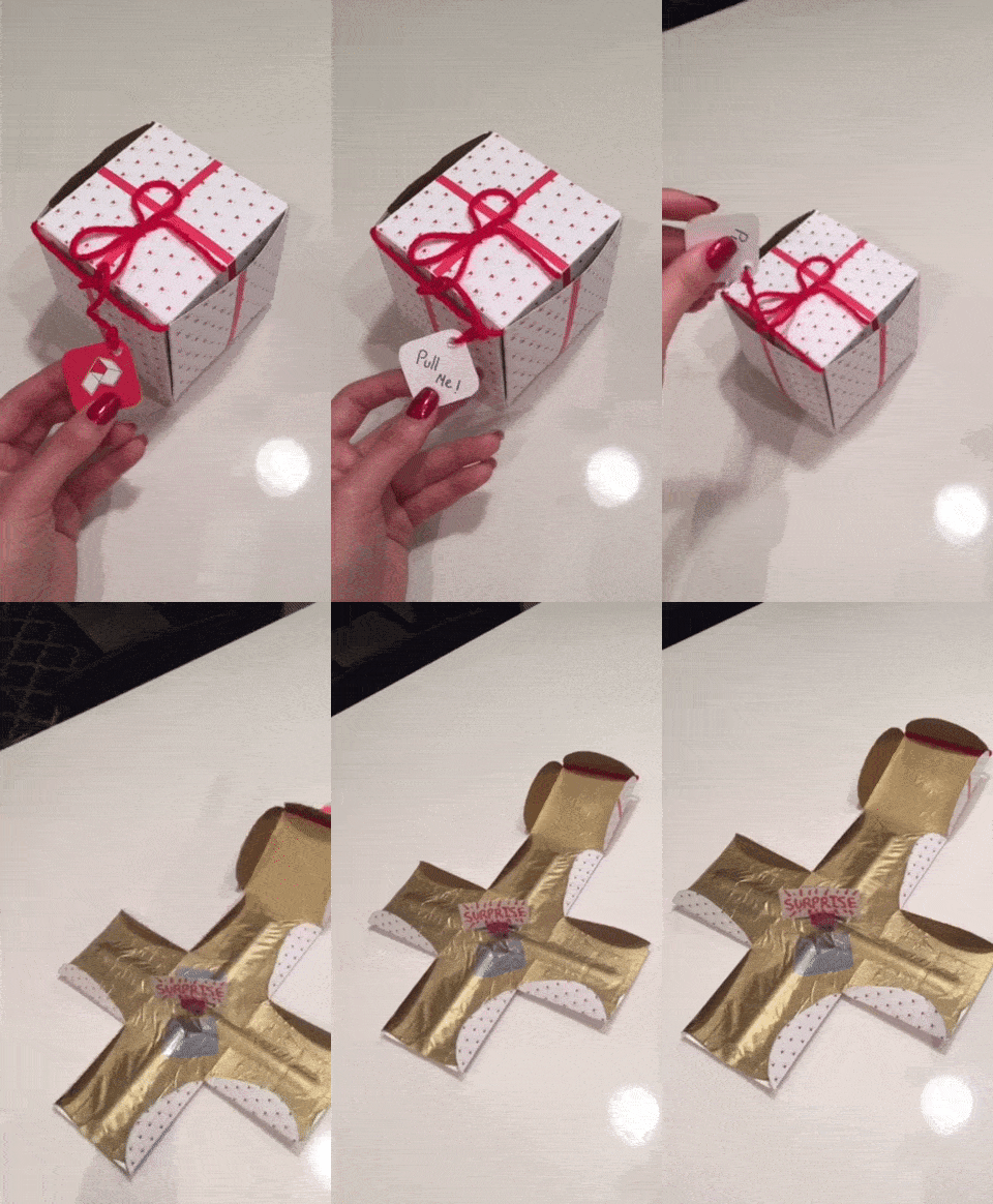
The structure unfolds as soon as the box opens, creating a quick reveal before the activities appear.
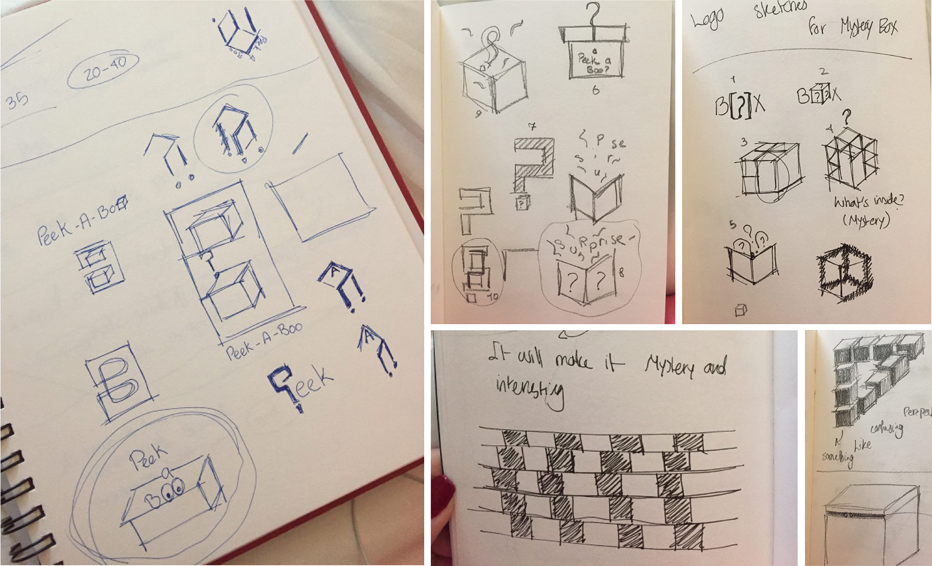
I sketched different structures, opening moments and logo ideas to see how surprise could shape the full experience, not only what was inside the box.
The first logo direction used bold shapes and playful typography to communicate energy and curiosity. It introduced the idea of surprise, but felt less distinctive when applied across the full project. Also, it became too detailed at smaller sizes.
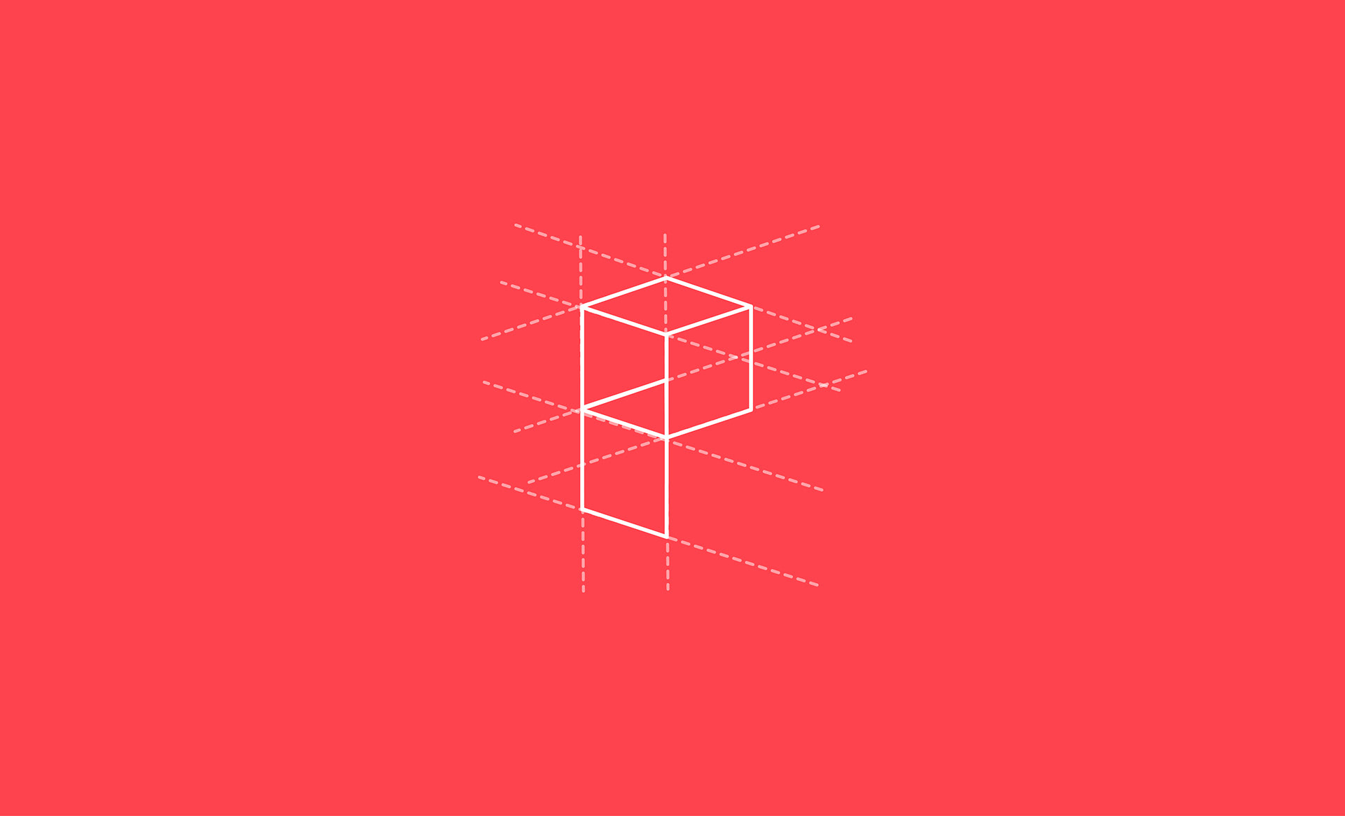
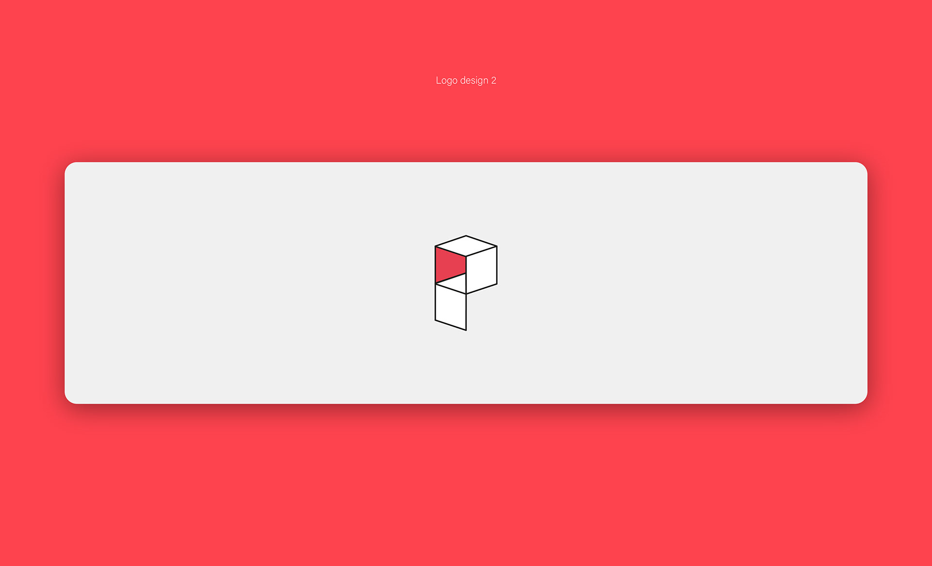
The chosen mark turns the P from Peek A Boo into an open box, with the red panel hinting at the surprise inside.
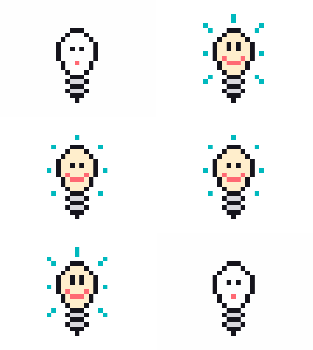
The second direction captured the surprise emotion more clearly through the character’s expression and the playful relationship between the type and illustration. We selected this option because it felt more memorable and worked better across the box and posters.
I designed the poster to introduce the playful and unexpected moments. The bold composition, expressive character and bright colours were used to catch attention while keeping the visual identity consistent with the packaging.