

Castofly is a web-based video creation platform built for people without editing experience.
I created its brand identity and expanded it into a flexible visual system used across the product, website, promotional videos, and social content.
As Castofly’s sole Lead UX/UI Designer, I designed the logo, wordmark, colour system, typography, app icons, and foundational UI styles.
Because I also designed the product, I could carry the same identity from the first brand impression into buttons, feedback states, and everyday product interactions.
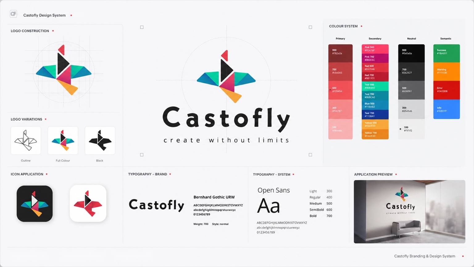
Castofly was evolving from an early-stage tool into a fuller video creation platform. It needed more than a memorable logo. It needed a visual language that could stay recognizable across a dense editor, marketing pages, app icons, videos, and social content.
I built the system around a geometric bird in flight, then expanded it into logo variations, typography, colours, interface states, and reusable product foundations.
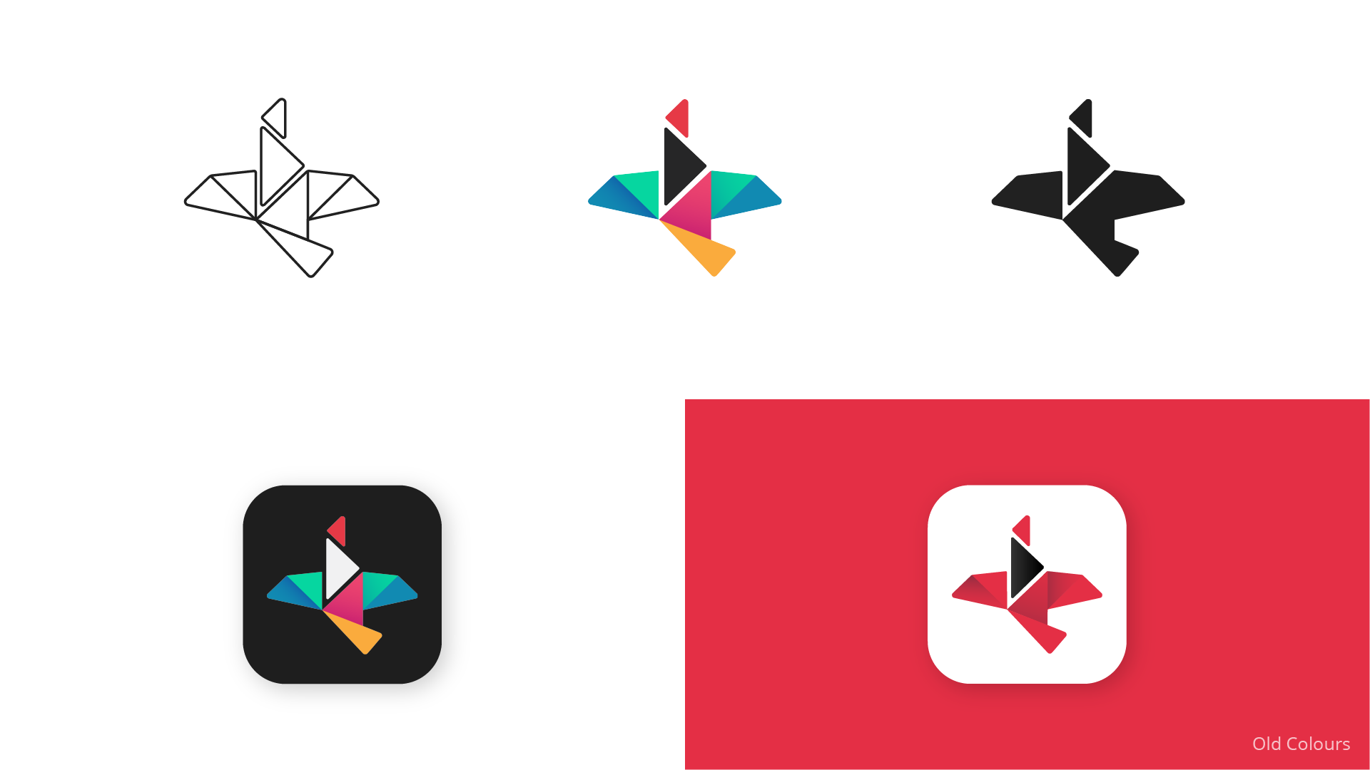
Castofly’s earlier identity leaned heavily on red and had limited range across the product and its marketing touchpoints.
The challenge was to create something more expressive and recognizable while giving the interface enough structure, contrast, and flexibility to grow from a small app icon into a complete product system.
The final mark brings several ideas into one geometric form.
The bird in flight represents speed and creativity. The central triangle connects the identity to video and the familiar play symbol, while the letter T is hidden inside the form as a reference to Castofly.
The separate coloured pieces represent different people, ideas, and media coming together to create one story.
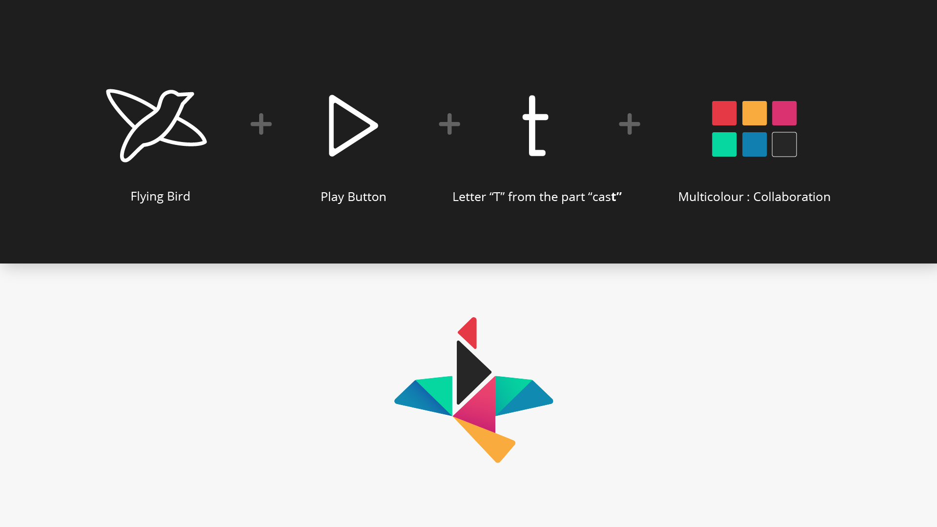
The geometric bird, multicolour palette, and distinctive wordmark gave Castofly its personality.
Inside the product, Open Sans, functional colours, and reusable UI states created a quieter layer that supported readability and longer editing sessions.
This balance allowed the brand and product to feel connected without letting the identity compete with the work users were creating.
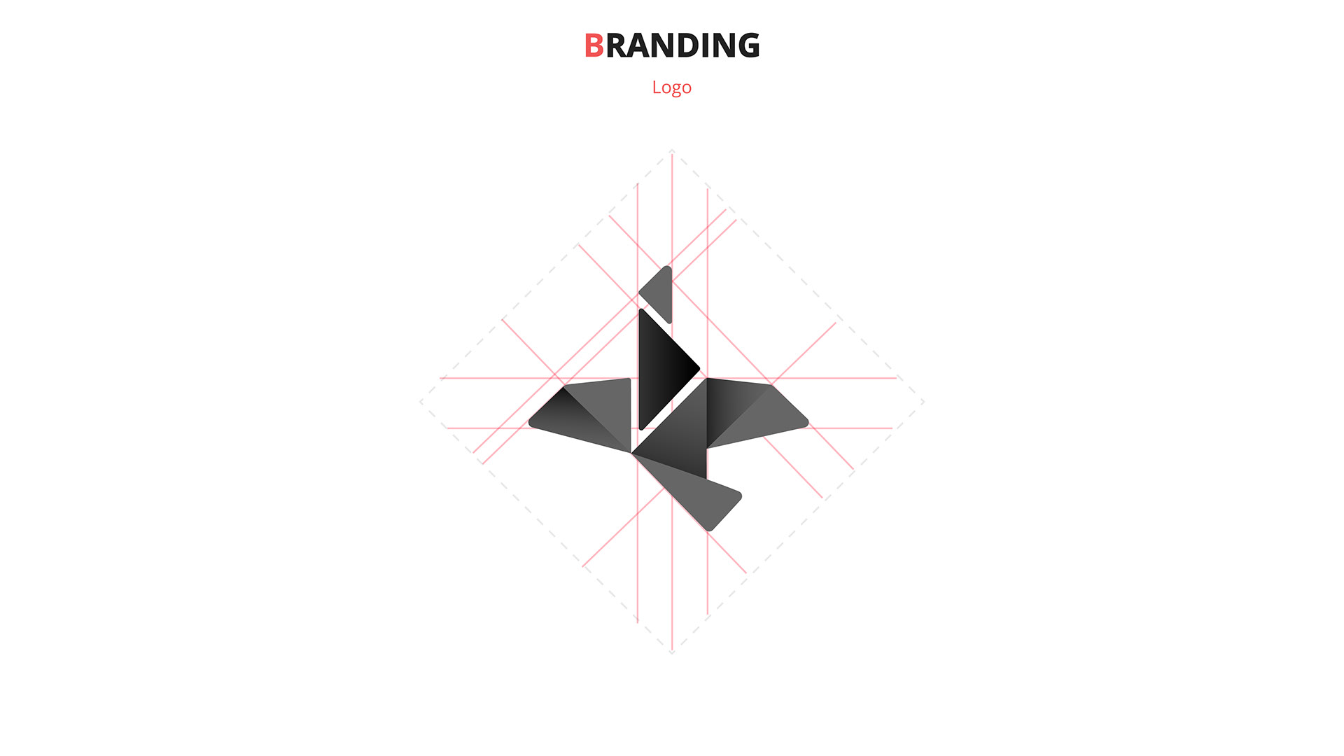
I tested the logo as an outline, full-colour mark, monochrome symbol, and compact app icon.
Working across these formats helped me simplify the geometry and make sure the silhouette stayed recognizable at different sizes and on both light and dark backgrounds.

The original direction relied mainly on red. I kept red as part of the identity but expanded the palette with teal, blue, pink, and yellow.
The broader palette better represented collaboration and creative variety. It also gave me more flexibility for illustrations, product states, marketing content, and different visual themes.
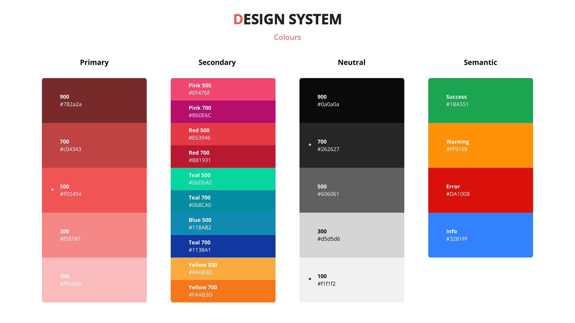
I used Bernhard Gothic URW for the Castofly wordmark. Its unusual shapes gave the brand a more recognizable and playful voice.
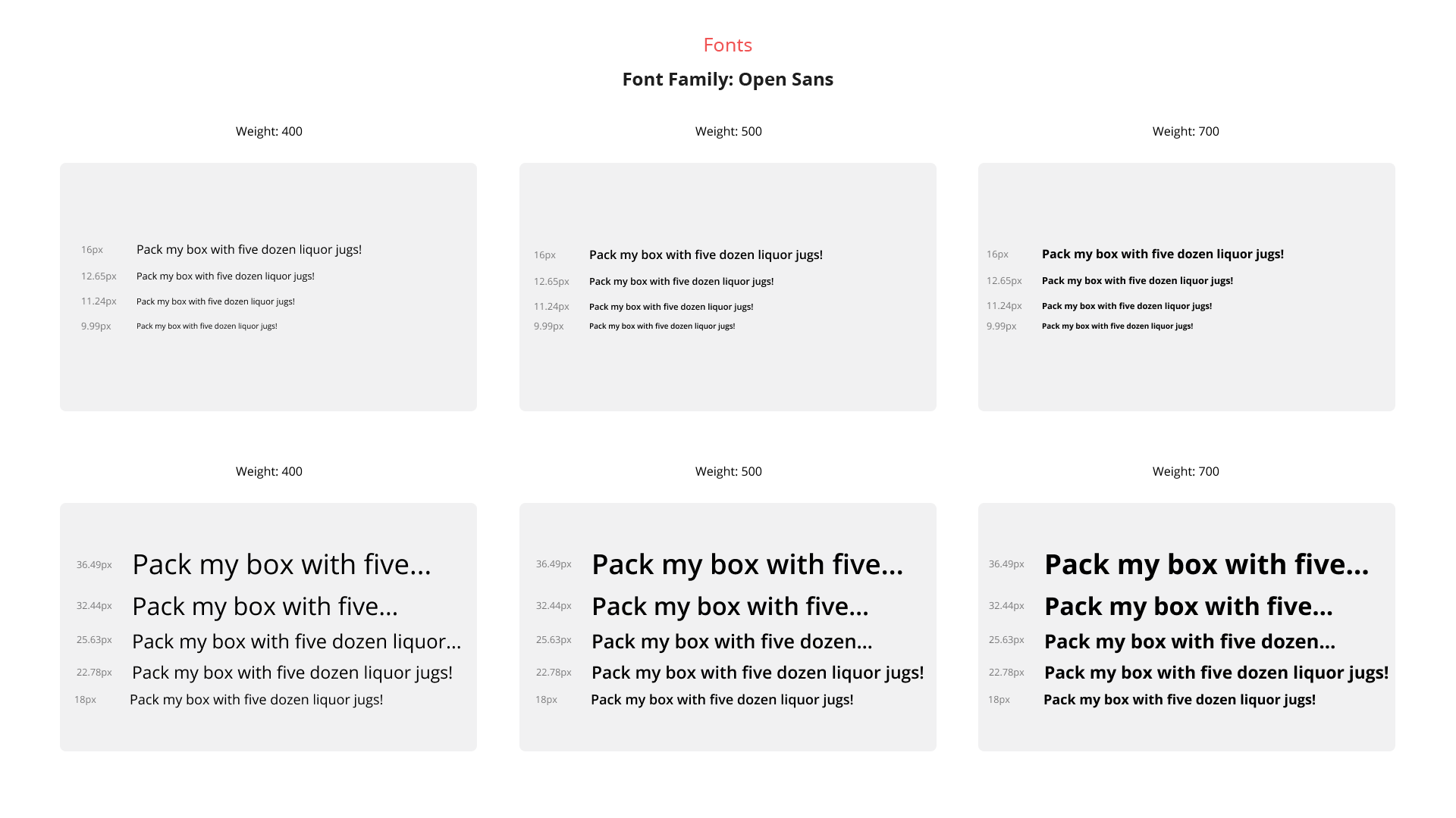
For the product interface, I selected Open Sans as a quieter and more readable counterpart. I defined a type scale using regular, medium, and bold weights to maintain hierarchy across the editor and supporting pages.
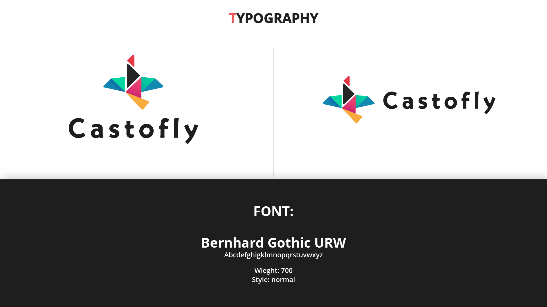
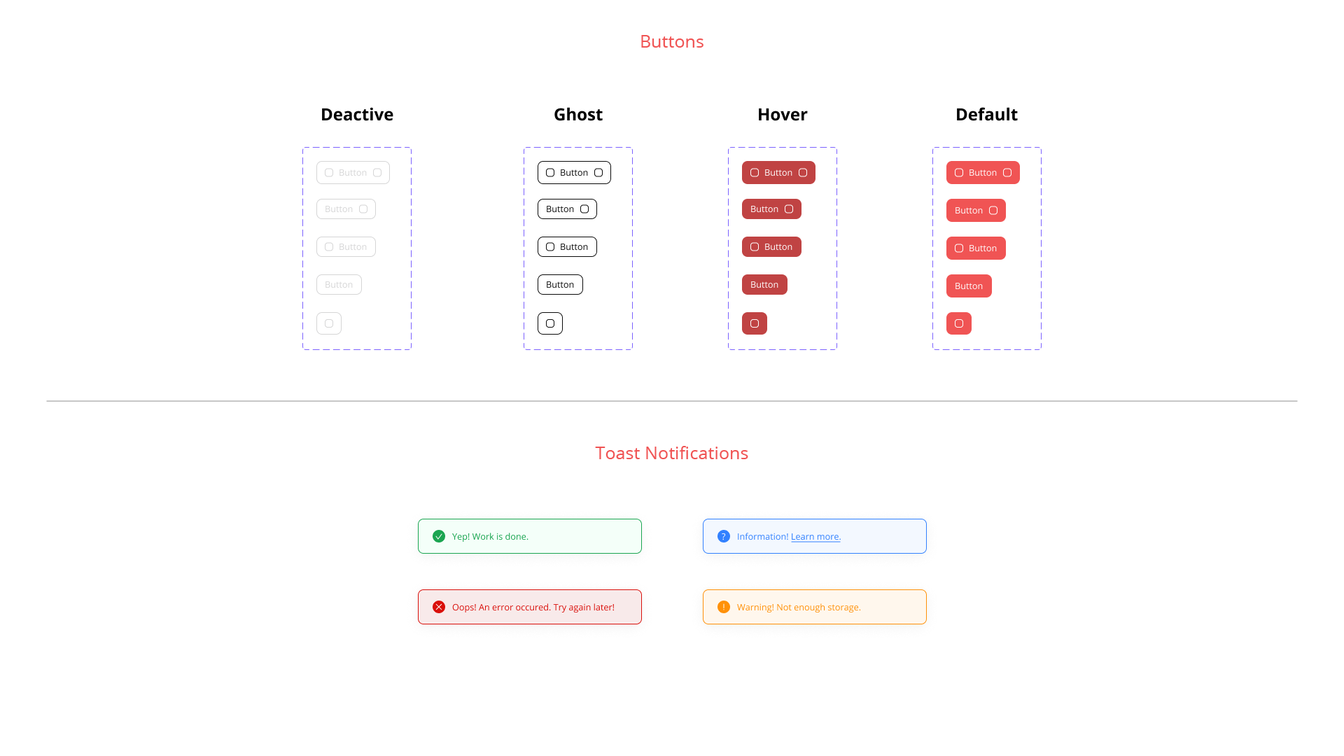
I organized the palette into primary, secondary, neutral, and semantic colours, then applied those foundations to buttons, feedback states, and notifications.
This gave the product and marketing experience one shared visual language while keeping functional interactions predictable.
The identity included full-colour, outline, monochrome, wordmark, and app-icon variations.
This allowed the logo to remain recognizable across different backgrounds, sizes, and applications without relying on one fixed version.
Bernhard Gothic URW gave the brand its distinctive personality, while Open Sans created a clear and readable foundation for the interface.
Together with the expanded colour palette, these foundations helped Castofly feel expressive in marketing moments and structured inside the product.
Buttons, semantic colours, and toast notifications brought the identity into everyday product interactions.
Using shared visual rules across these states made the experience feel more connected, understandable, and predictable.
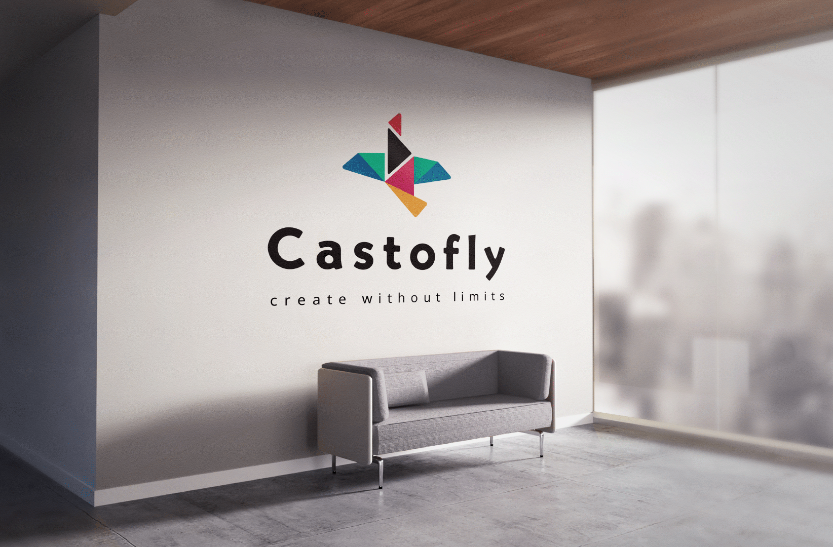
The identity became the visual foundation for Castofly’s product, website, promotional videos, and social content.
Designing both the brand and product allowed me to maintain consistency from the logo and app icon to editor states and feedback messages. The system also gave the team a clearer foundation for making future design decisions as the platform grew.
The biggest lesson was that a brand system should do more than look polished. It should make the product easier to design, build, and recognize.
Explore the editor, onboarding, recording tools, templates, collaboration features, and broader Castofly product experience.
.png)
Explore the audio-to-video product created within Castofly, including transcript tools, media, audiograms, collaboration, and exporting.