




Millions of British Columbians rely on ICBC for some of life’s most important moments: getting licensed, insuring their vehicle, reporting a claim after a collision. Before My ICBC, those services lived in separate systems with different sign-in flows, inconsistent branding, and no shared account. My ICBC brings it all into one responsive, self-service platform, so people can manage what matters without having to figure out where to go first.
I was part of the team that designed and built this experience, contributing end-to-end across Billing and Payments, responsive design, usability testing, and cross-functional collaboration at scale.
Across the broader My ICBC platform, I owned the payment plan experience within Billing & Payments page, one of the most complex service areas on the platform, exploring best layout options, designing low-fidelity wireframes through to high-fidelity interactive prototypes and different payment plan statuses in Axure RP.
Beyond Billing and Payments, I contributed across the platform by designing responsive experiences with a focus on mobile usability and accessibility, facilitating and observing usability testing sessions and translating findings into concrete design iterations, identifying UX improvements through research, user feedback, and analytics, and helping establish consistent patterns across the My ICBC ecosystem to support design coherence at scale.
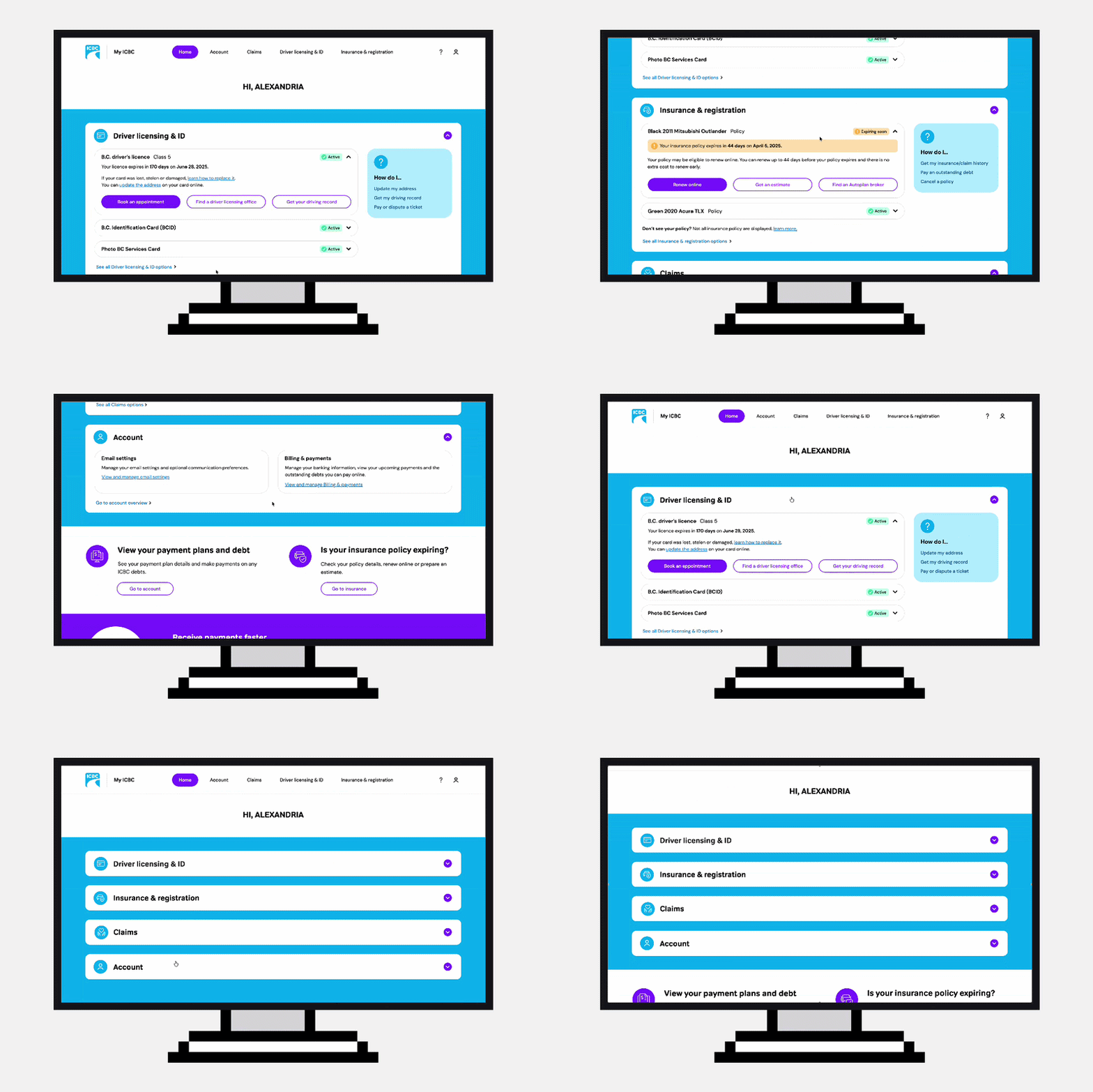
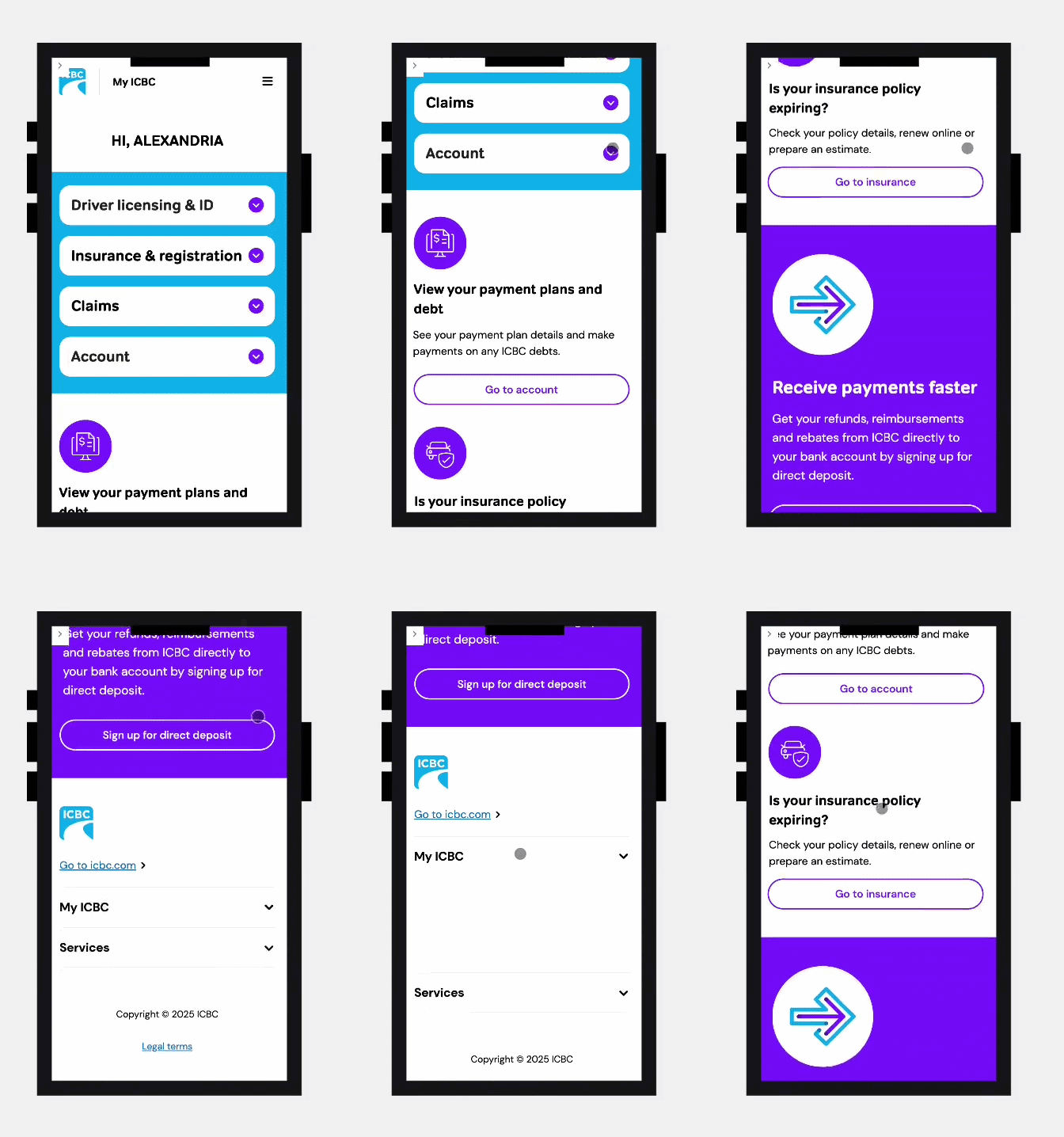

My ICBC is a unified self-service platform that brings together driver licensing, insurance, claims, billing, payments, and account management into a single digital experience for British Columbians.
Before My ICBC, all services existed across separate systems with different sign-in experiences and navigation patterns. This created fragmented journeys and made it difficult for users to manage their services in one place.
The platform was designed to provide a more connected, accessible, and self-service experience where customers can access essential ICBC services through a single account.

[[divider]]

[[divider]]

[[divider]]

[[divider]]

[[divider]]

[[divider]]

[[divider]]

[[divider]]

[[divider]]
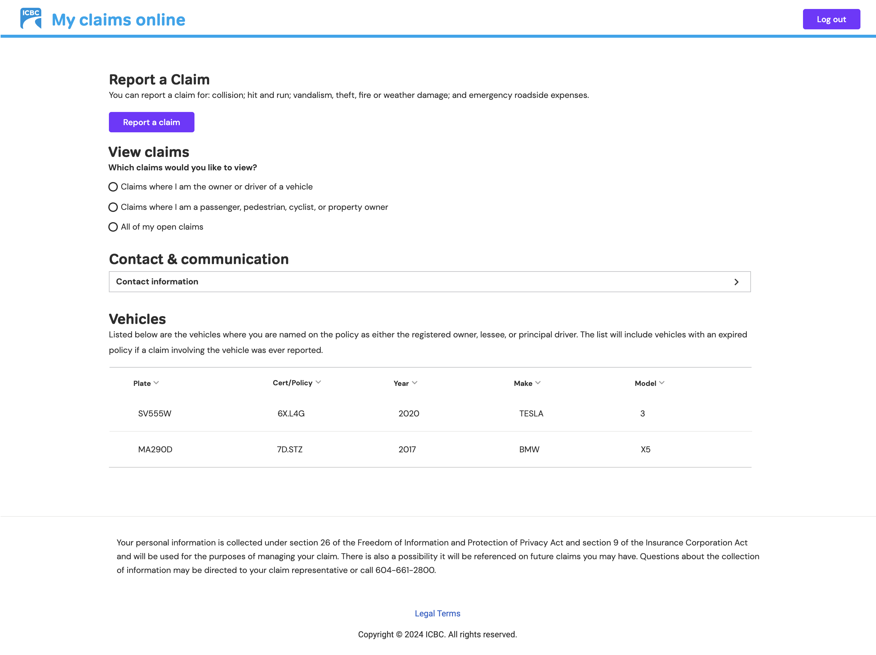
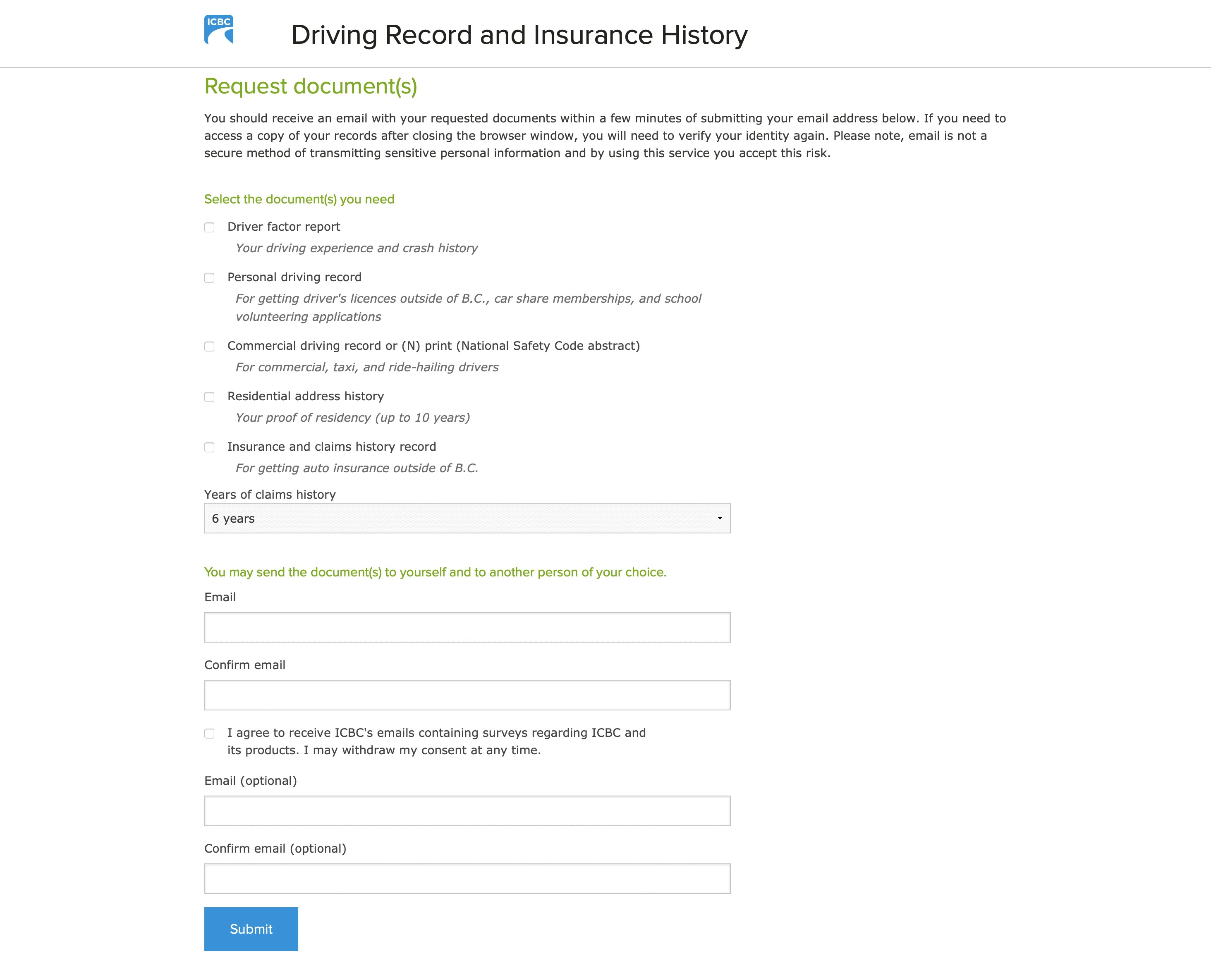
Before My ICBC, services such as driver licensing, insurance, and claims were maintained independently.
Users often had to sign into multiple systems to complete related tasks. Branding, global headers and experience patterns varied between services, creating friction and inconsistency.
[[divider]]
[[divider]]

[[divider]]

[[divider]]
Users frequently questioned whether they were still interacting with an official ICBC experience when branding and experiences changed between services.
The challenge was not simply designing screens. It was helping unify disconnected systems into a trusted and cohesive experience.
To validate navigation, authentication, discoverability, and payment experiences across My ICBC, we conducted moderated usability testing across desktop and mobile.
I participated in facilitation, observation, note taking, and translating findings into design improvements and prototype iterations.
Participants completed realistic tasks across authentication and sign-in, dashboard navigation, claims and insurance journeys, billing and payment plans, direct deposit, and account management.
Testing revealed a strong overall success rate, with most participants completing tasks successfully and reporting a positive ease-of-use experience.
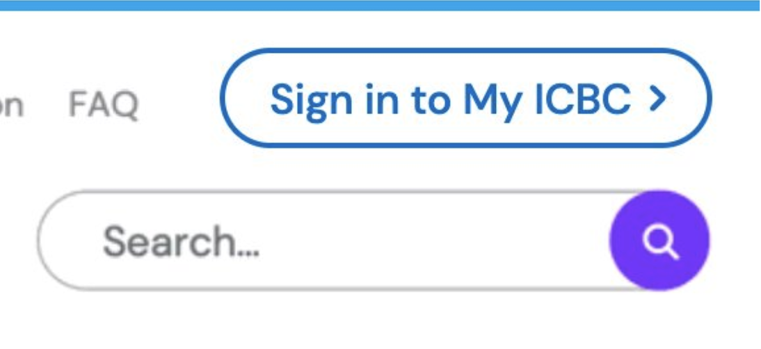
17 out of 18 participants struggled with sign-in visibility.
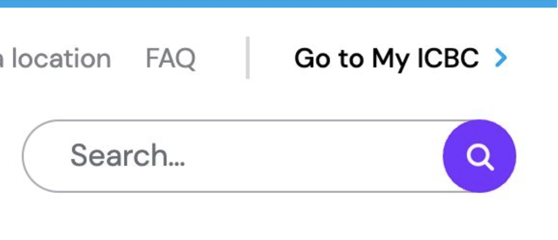
Improved sign-in visibility by adding a border around the Call to Action button and change the text colour from black to navy.
[[divider]]
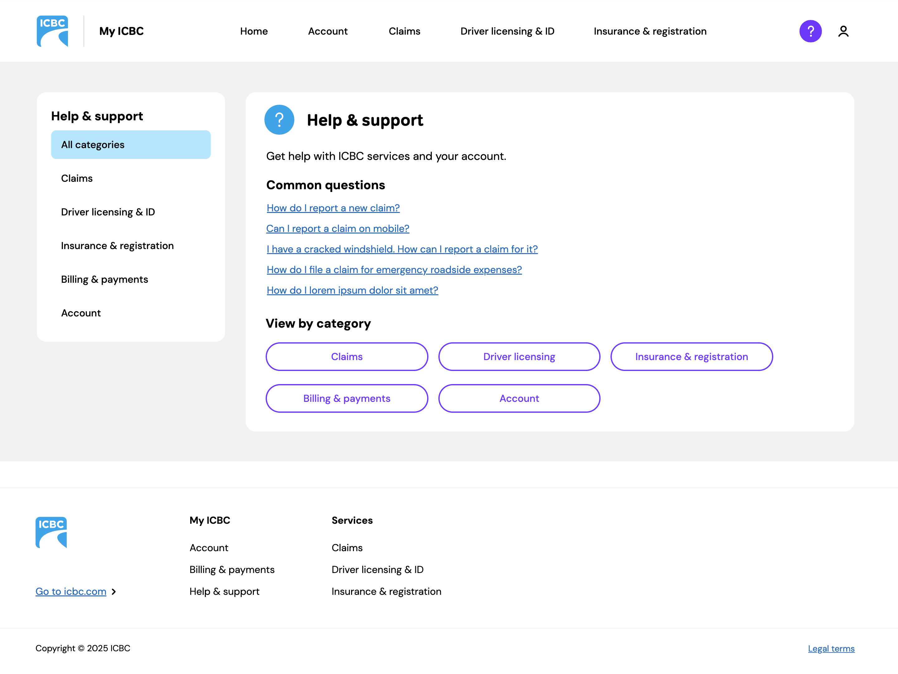
Participants sometimes associated payment tasks with insurance or claims and struggled to find payment-related information.
Task for the users to complete was to find out Why was payment withdrawn on another date
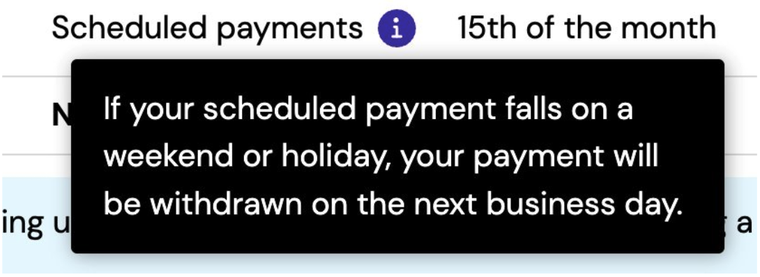
Due to these results, prototype was iterated for the remaining 8 participants and tooltip was moved into blue info box.

[[divider]]


[[divider]]
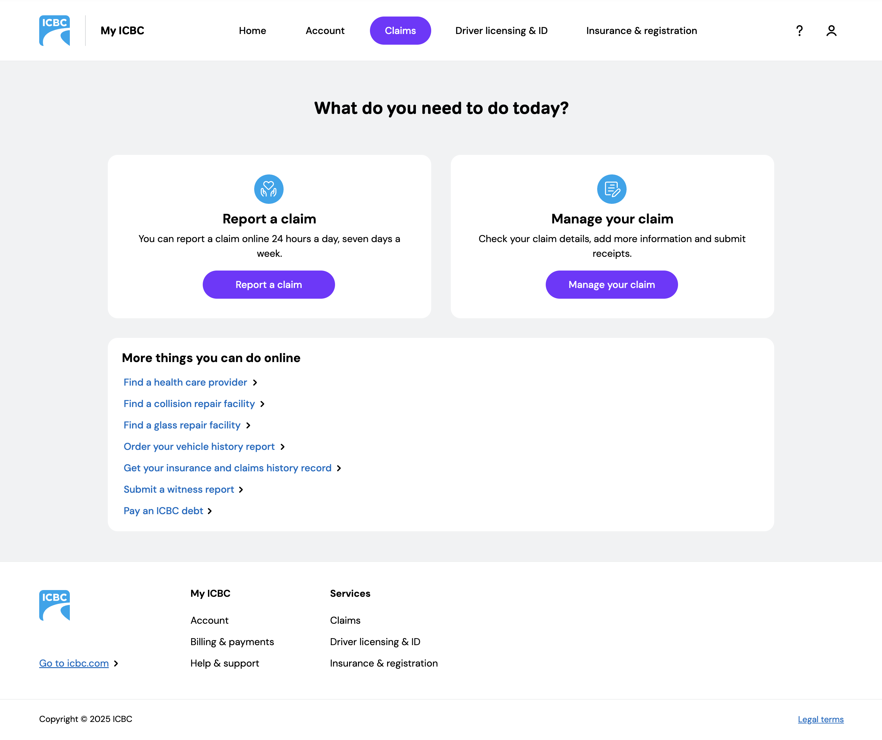
3 of 6 bypassed eligibility questionnaire by selecting "manage claims" instead of report a claim.
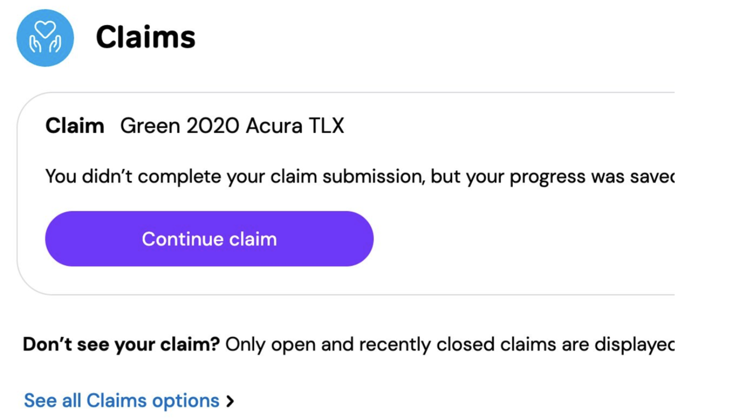
To try to drive most customers through the eligibility questionnaire before they begin the process, added a link to report a claim from My ICBC dashboard

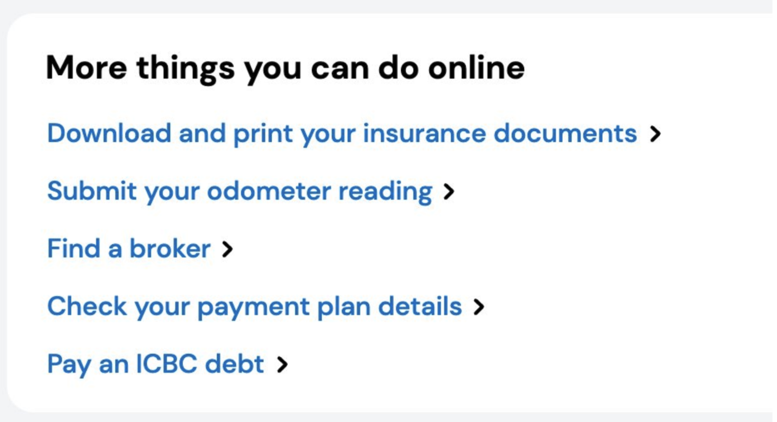
7 of 18 associated debt with claims, and searched these sections first
Add redundant navigation (cross-linking) to all landing pages to billing & payment
[[divider]]

[[divider]]
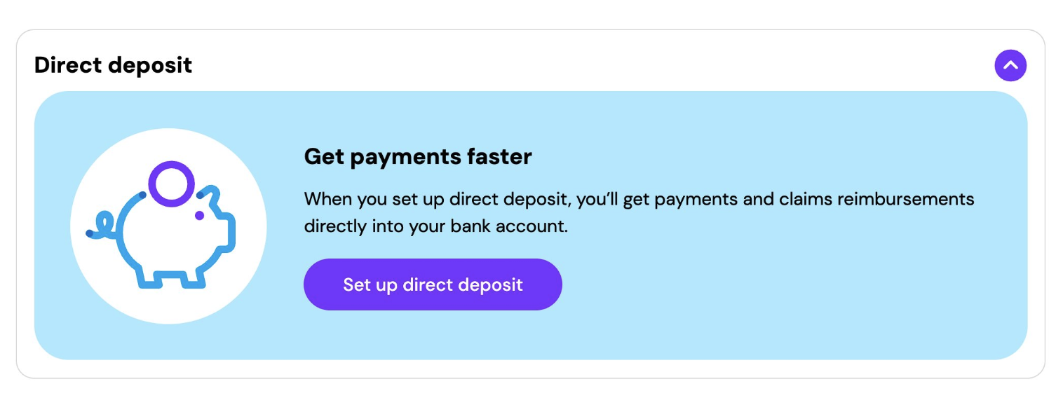
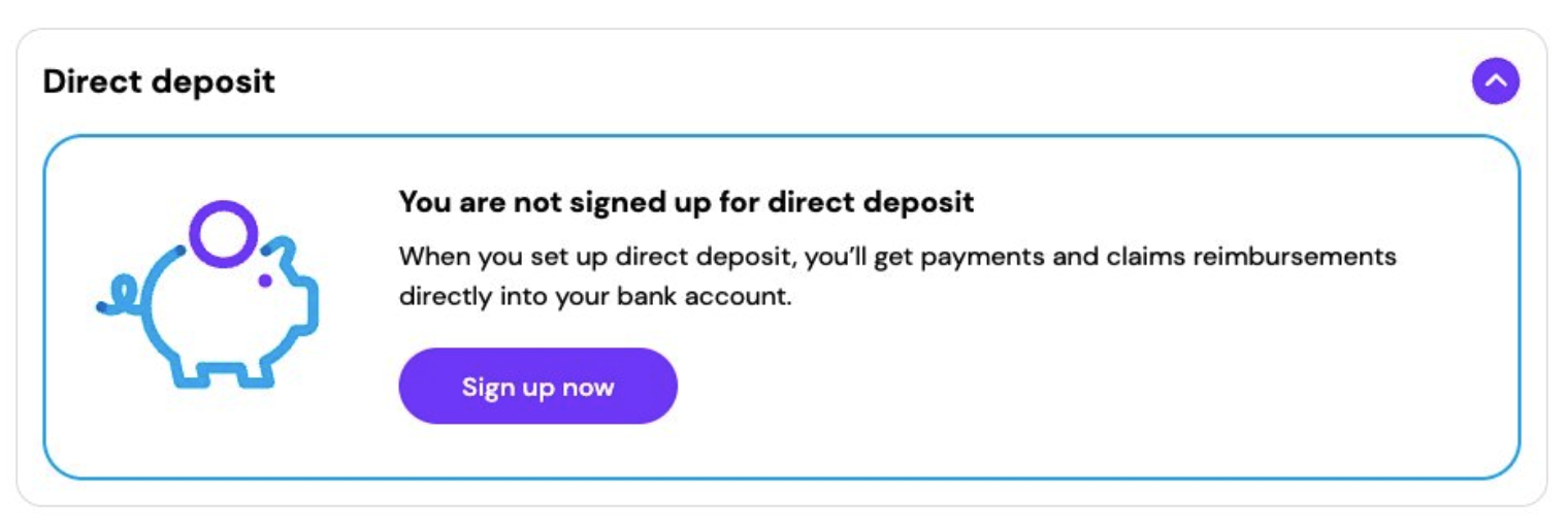
6 of 18 navigates to Billing & Payment, did not easily find direct deposit section
[[divider]]
Testing reinforced the value of designing through real behaviour rather than assumptions.
By observing users, identifying friction points, and iterating prototypes, we helped shape clearer and more intuitive experiences across My ICBC.
My ICBC needed to do something genuinely hard: make a complex, multi-service government platform feel simple and trustworthy to millions of people with different needs, devices, and comfort with digital tools.
The dashboard brings driver licensing, insurance, claims, and account services into one experience, with clear navigation and contextual actions that help users move directly into tasks without having to orient themselves first. Each service area uses collapsible sections to reduce visual overload while keeping important information within reach.
Within Billing and Payments specifically, the challenge was hierarchy. Users needed to understand their financial situation at a glance, across multiple vehicles, policies, and payment states, without feeling overwhelmed.
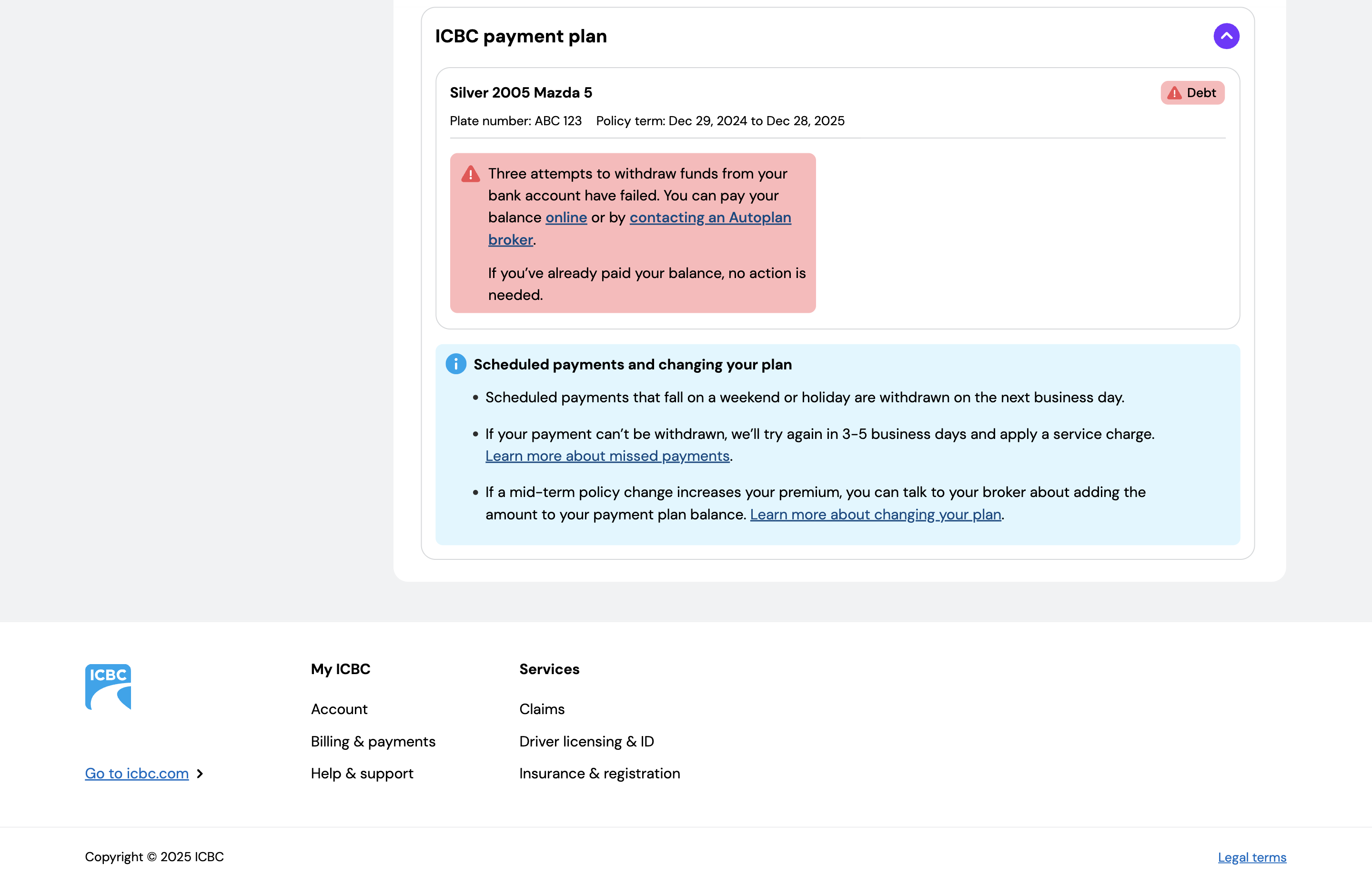
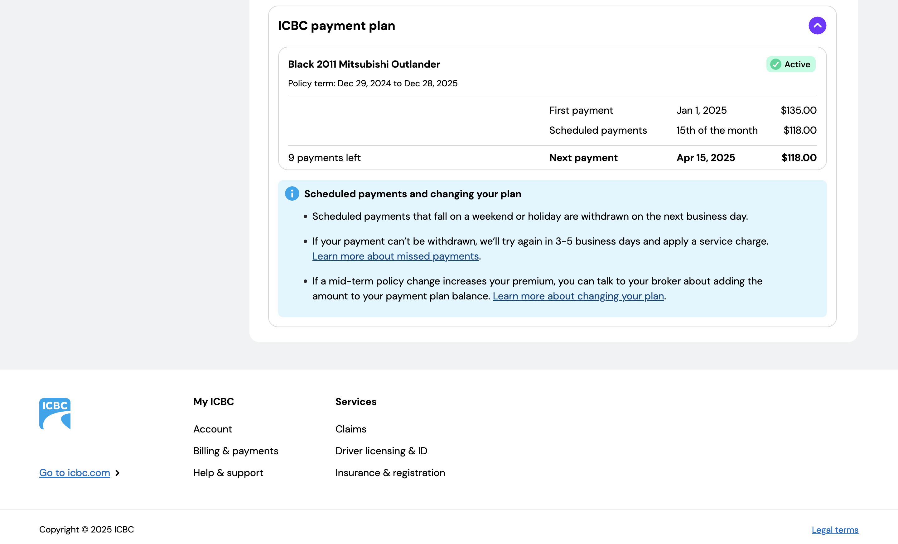
I designed a range of status experiences including active plans, missed payments, account issues, debt states, and empty states, ensuring the interface remained readable and trustworthy across all of them.
Designing My ICBC was not a clean linear process and that was the point. Services were being built in parallel, requirements evolved, and the work had to flex without losing coherence.
What made this process distinct was the scale of coordination involved. Decisions made in one service area had ripple effects across others. Staying aligned meant communicating constantly, advocating for consistency, and knowing when to move fast and when to slow down and get it right.
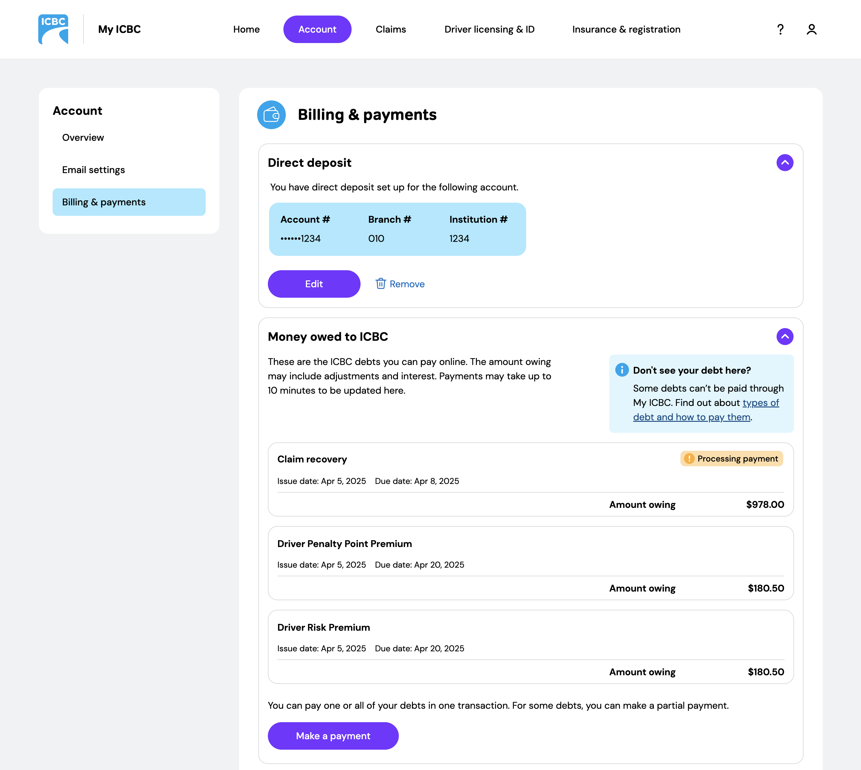
One of my primary focus areas within My ICBC was the Payment & Billing experience.

[[divider]]
Including different iterations to decide what is the most user friendly layout

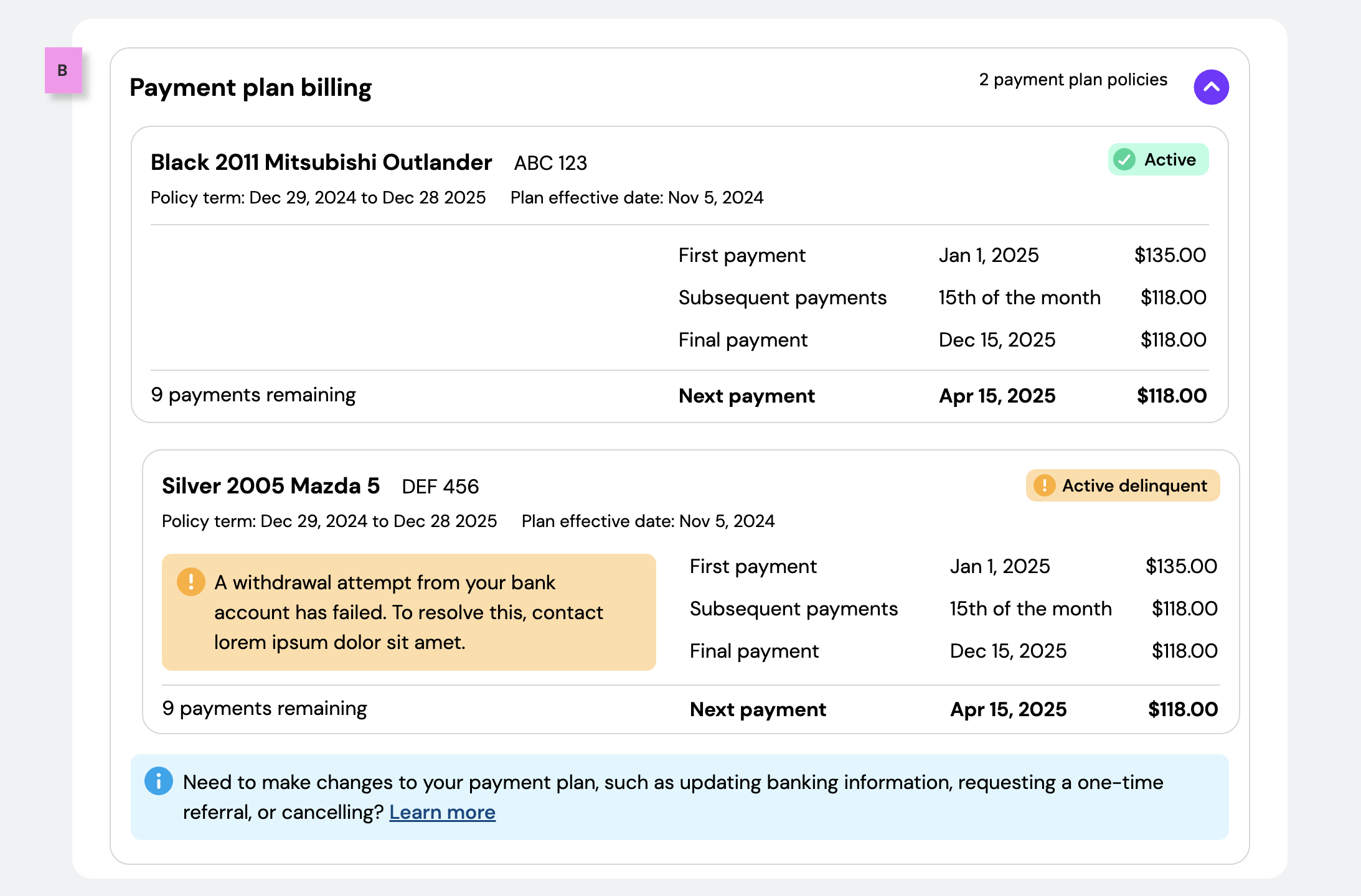
To priorotize the crucial information first and nice to haves to be developed later to meet budget and deadline
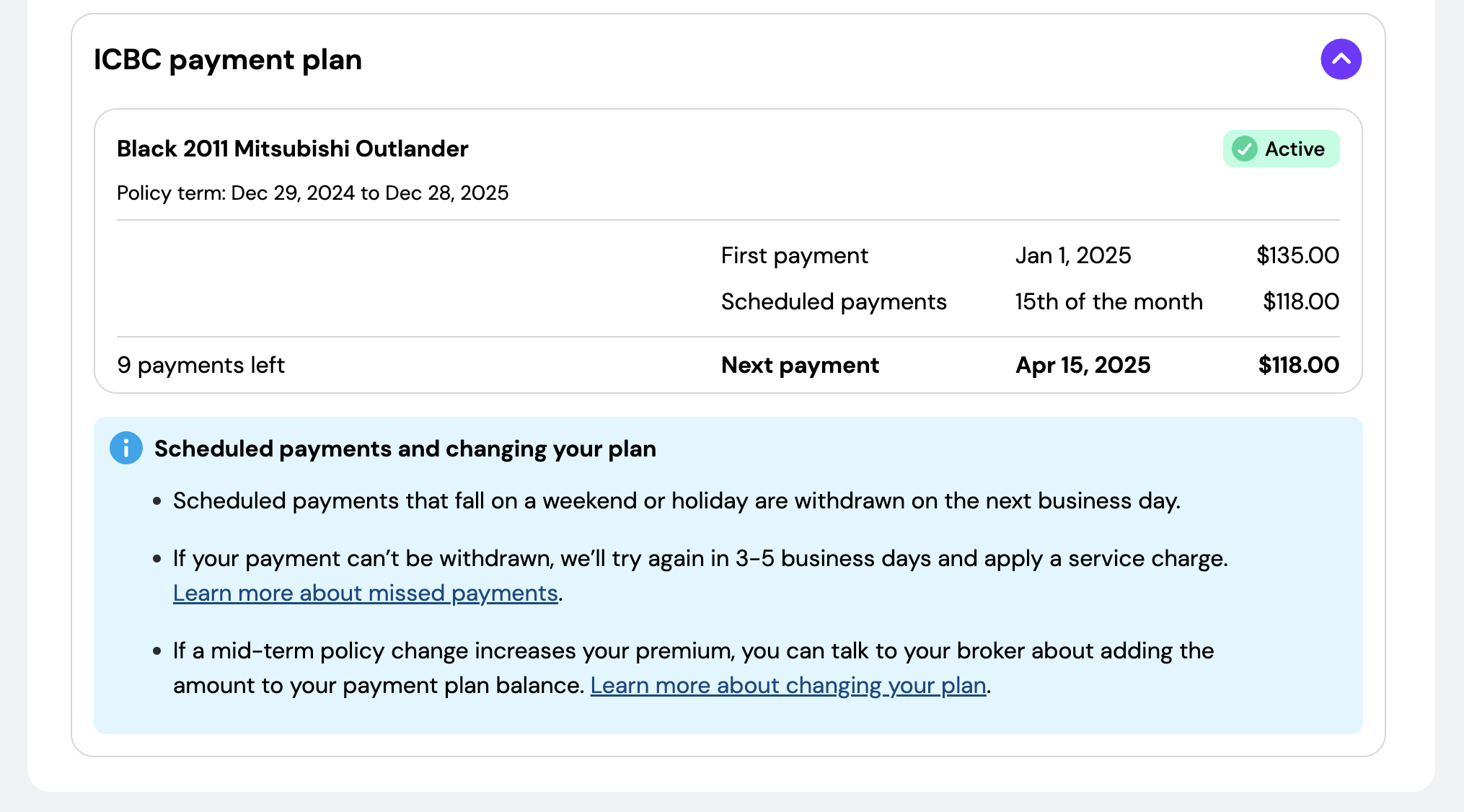
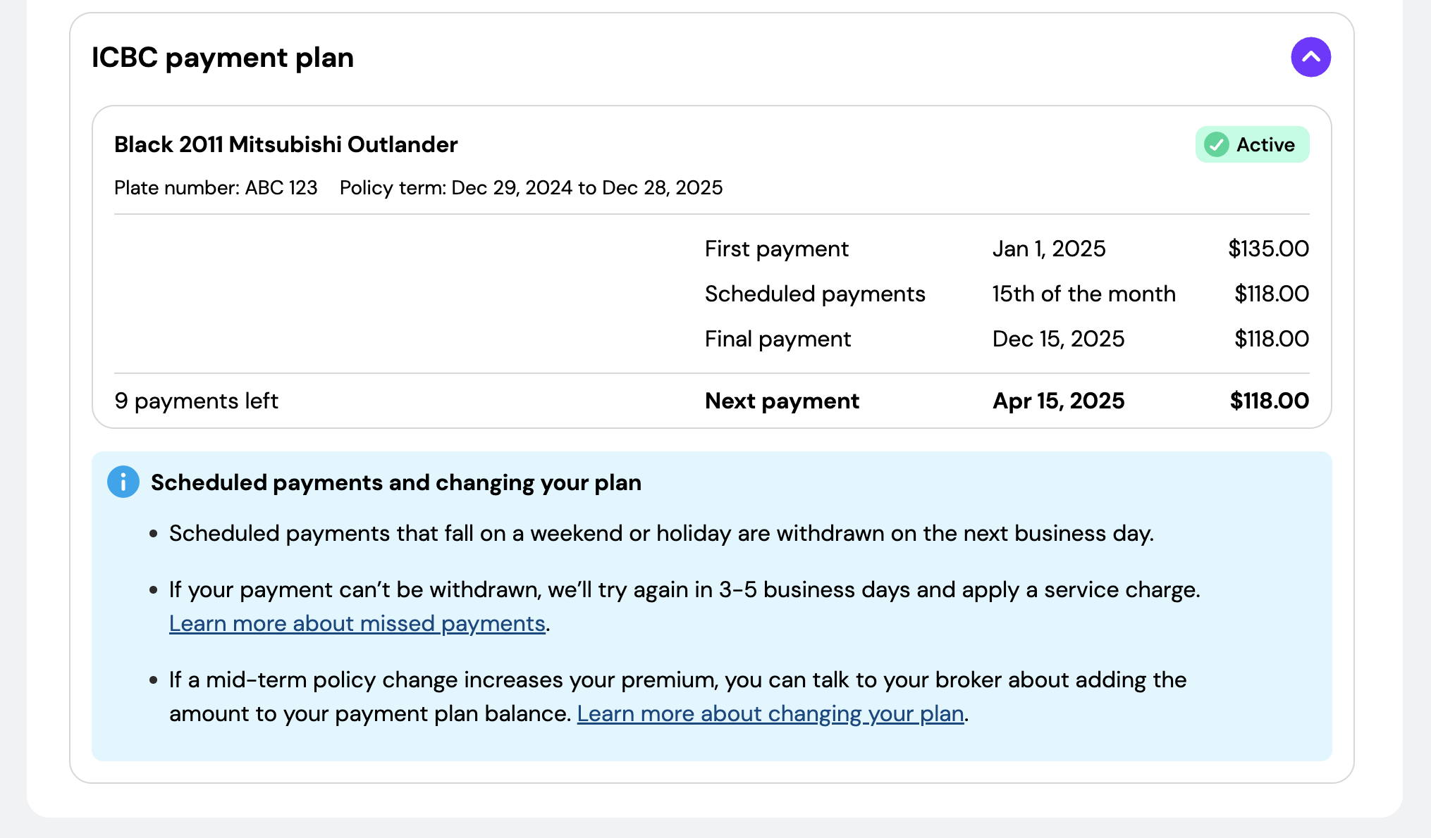

The payment plan interface needed to communicate a large amount of financial information clearly and confidently.
Users may manage multiple vehicles and policies while needing to understand payment status quickly.
Status indicators included:


[[divider]]
The information needed to remain readable, trustworthy, and easy to scan while balancing financial complexity and responsive design requirements.
Through testing, analytics-informed iteration, team reviews, and continuous refinement, the experience evolved into a clearer and more user-friendly payment system.
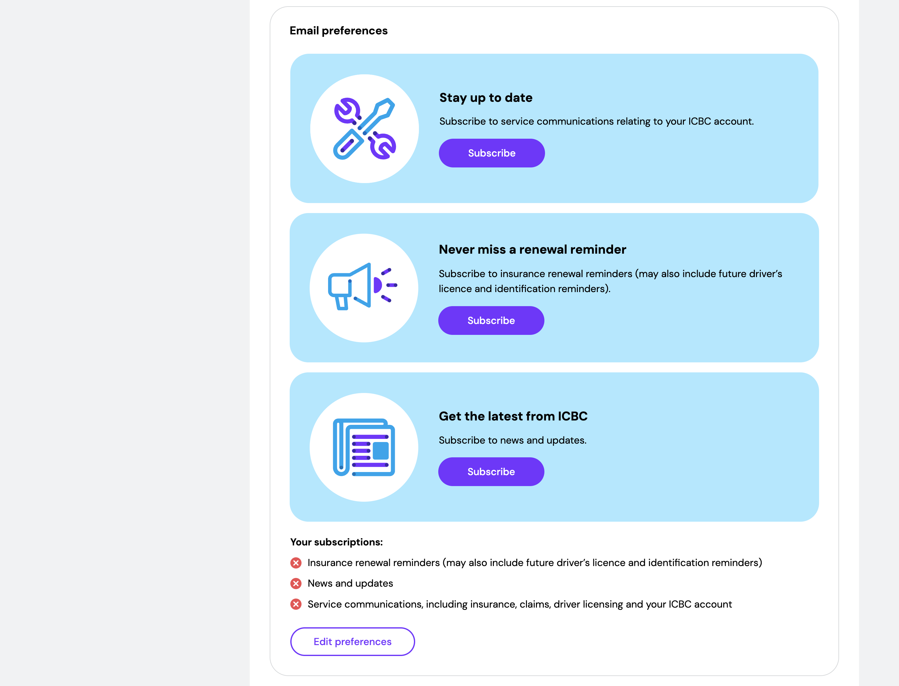
Over a six-month period, more than 60,000 British Columbians opted into email communications through My ICBC. For a government platform where most services are used once every few years, that kind of voluntary engagement is a strong signal of trust.
People renew their ID every five years. They file a claim after an accident. Traditional engagement metrics miss the value of a well-designed experience in those moments. But trust shows up in other ways, and it showed up here.
Designing for millions of British Columbians across services they rely on for life’s most important moments meant holding a long-term vision while making practical, MVP-grounded decisions along the way. It meant advocating for consistency when parallel workstreams pulled in different directions. It meant treating trust not as a nice-to-have but as a core design requirement.
This project deepened my ability to work at scale, balance policy and UX constraints, and deliver accessible, responsive experiences within complex institutional environments. It confirmed that the most meaningful design work often happens quietly, in the details users never notice because they just work.
Leading the end-to-end UX of a future self-serve experience for BC drivers.
I led the UX design of ICBC’s upcoming Card Online Renewal & Replacement experience, from research and flow creation to high-fidelity interactive wireframes, testing, iteration, and stakeholder collaboration.
Due to confidentiality and upcoming launch timelines, detailed screens are not publicly available