



The ECUAD Resume Builder is a web application designed for Emily Carr University students.
It helps students collect their education, experience, skills, and achievements in one master resume, then reuse the information to create more focused resumes for different opportunities. The project was part of a wider initiative to make the Career Development Office’s online resources more accessible, interactive, and useful.
I designed the experience from the initial user flow to the final interactive prototype.
My work included defining the master-resume concept, mapping the resume-building journey, creating wireframes, designing the visual interface, developing the colour and typography direction, and prototyping the key interactions.
I worked within Emily Carr’s existing visual identity so the new tool felt connected to the university’s other digital services.
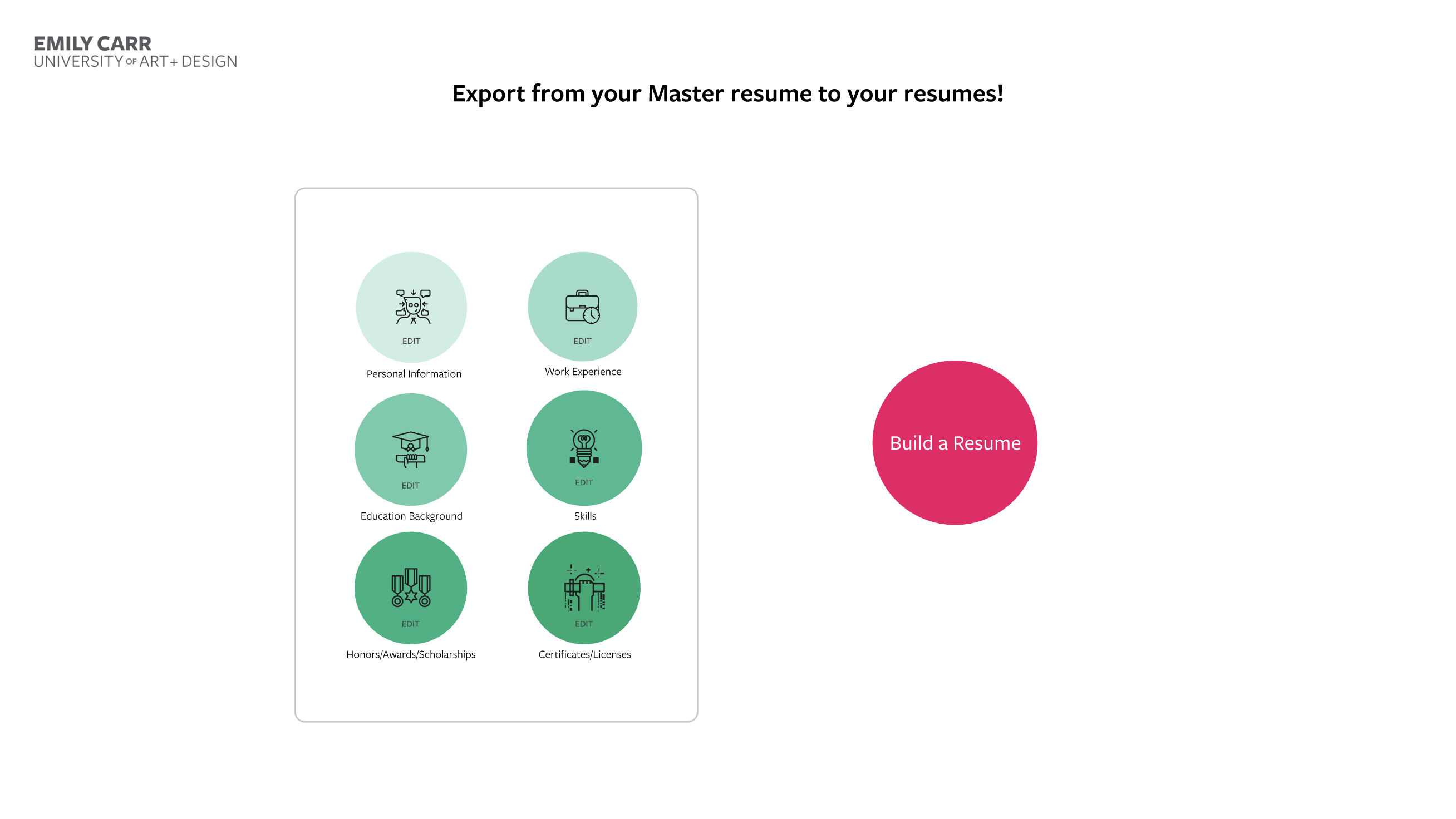
Students often need different versions of their resume for jobs, internships, exhibitions, graduate school, and other opportunities.
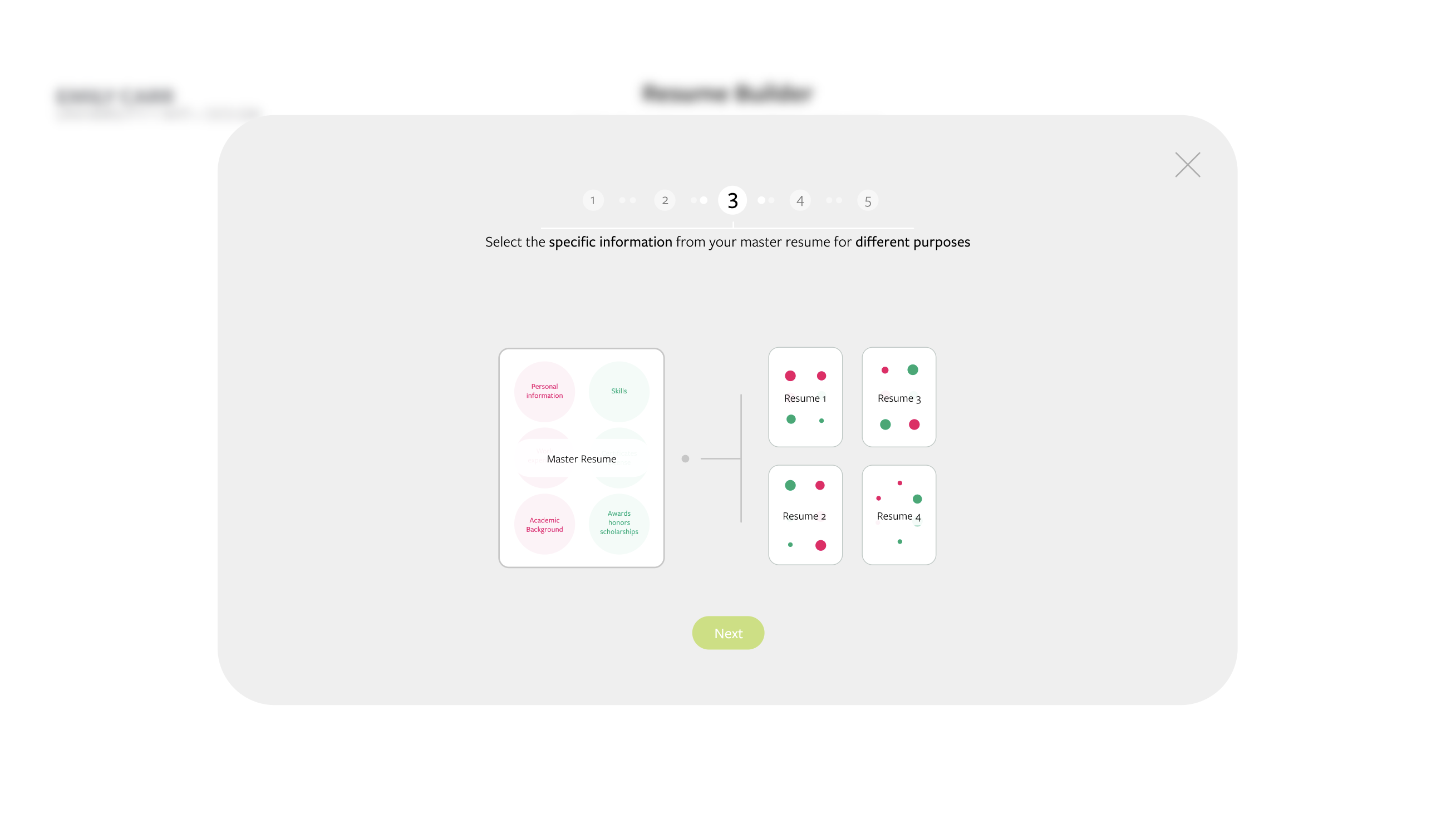
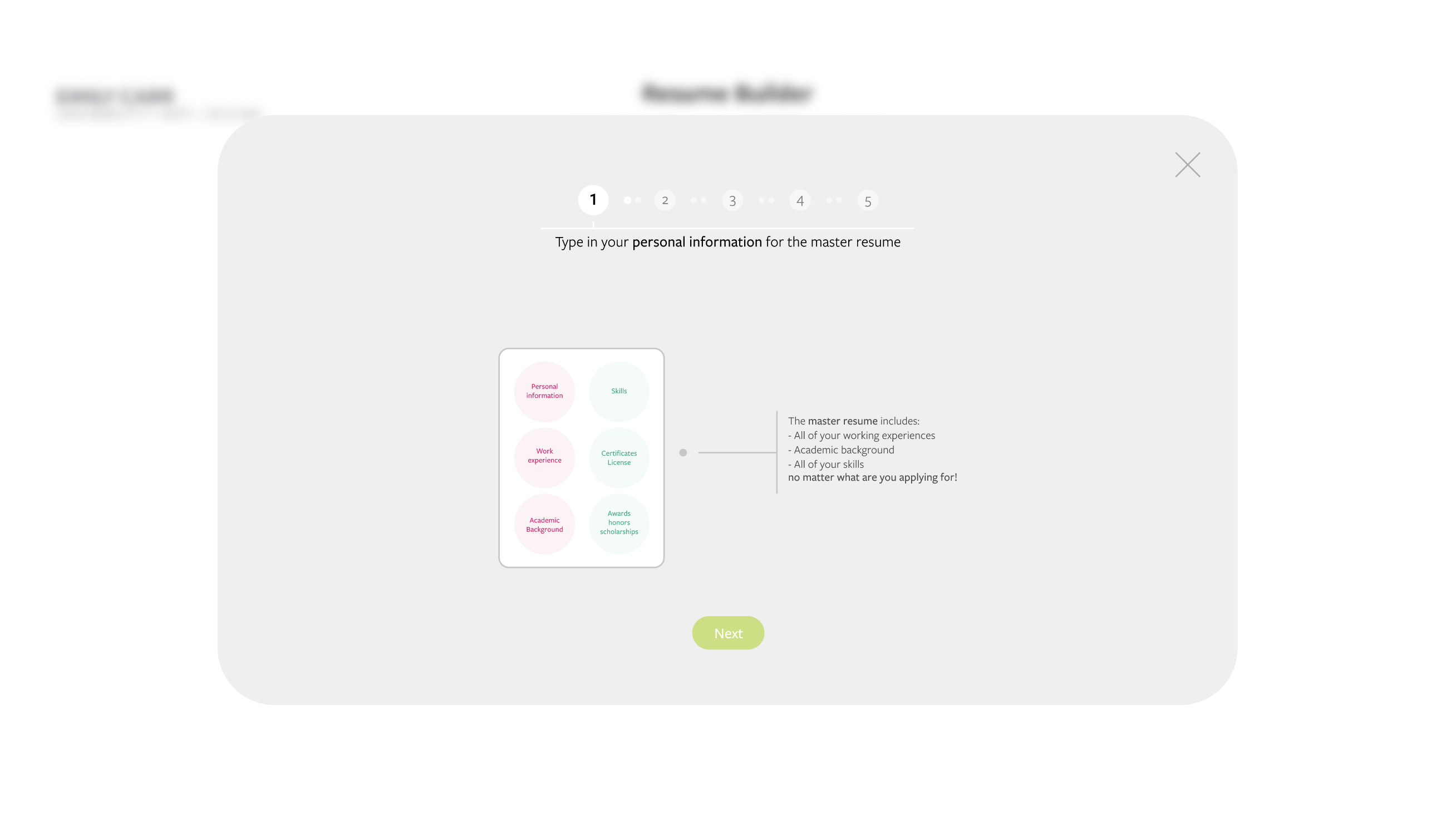
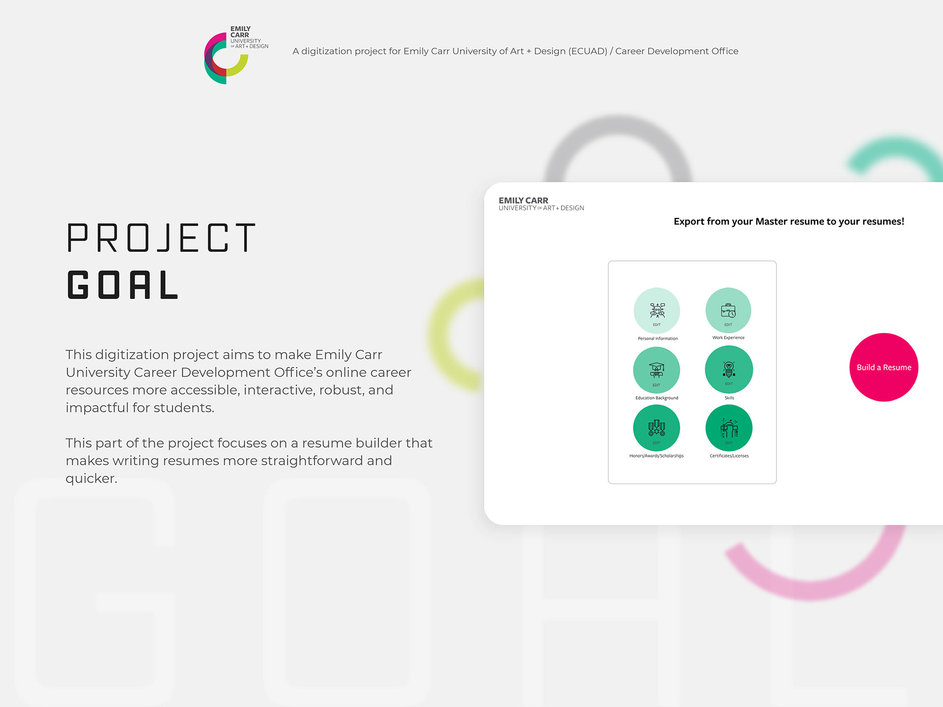
Instead of asking them to rebuild each version from the beginning, the tool introduced a master resume: one place to store personal information, work experience, education, skills, honours, and certificates.
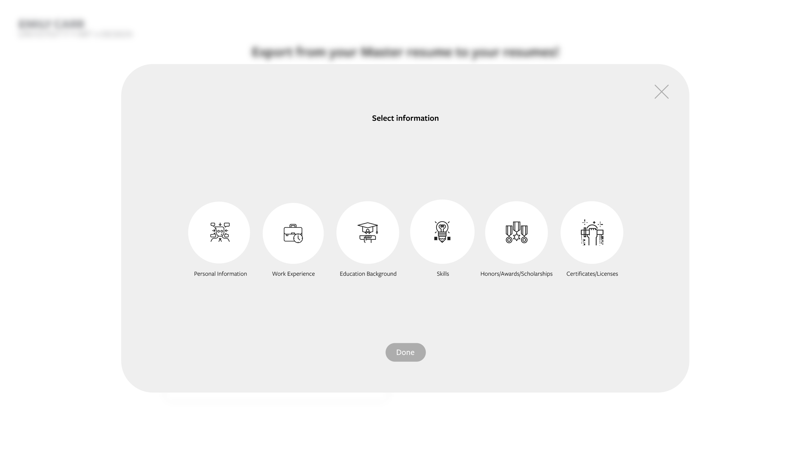
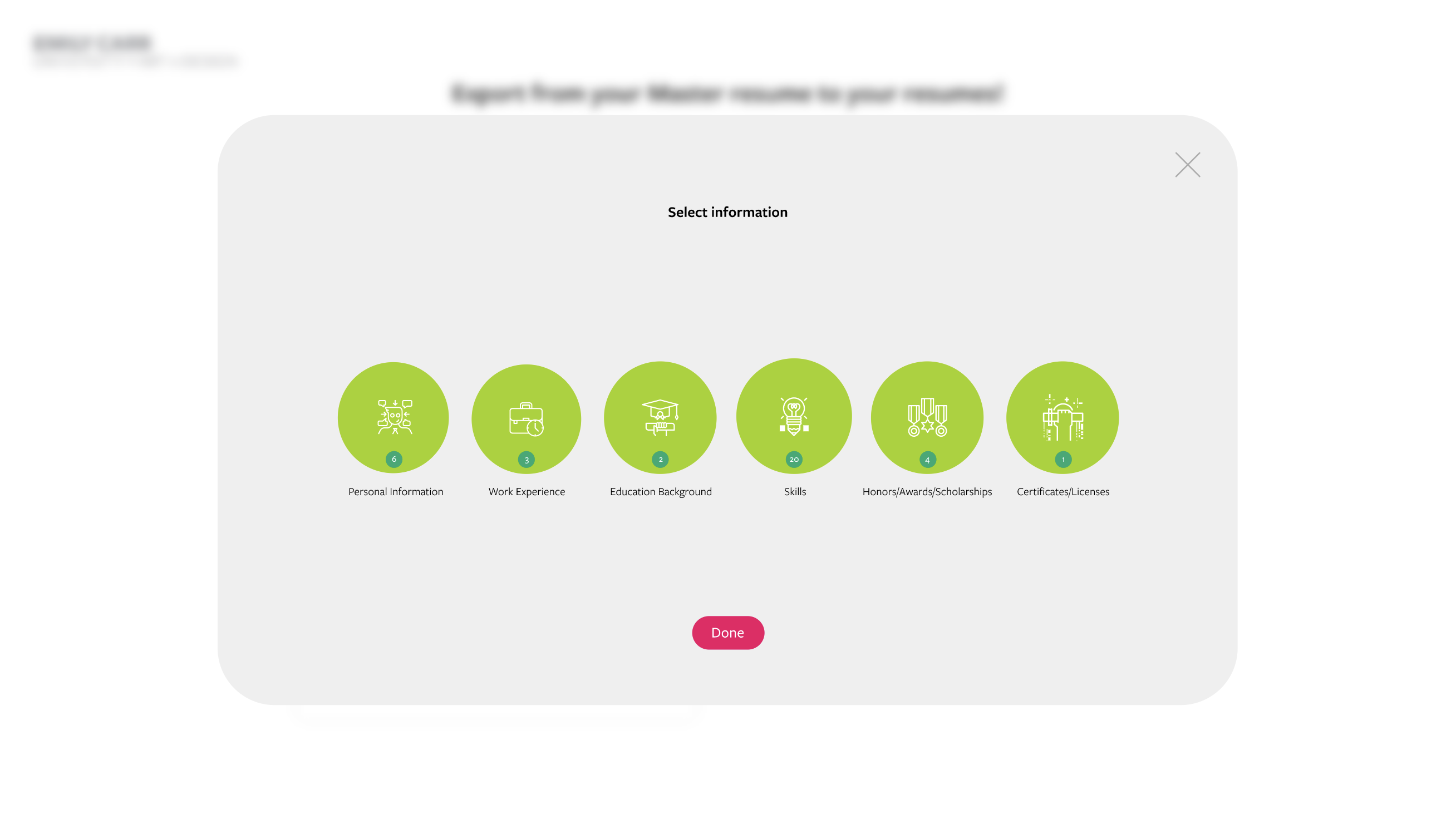
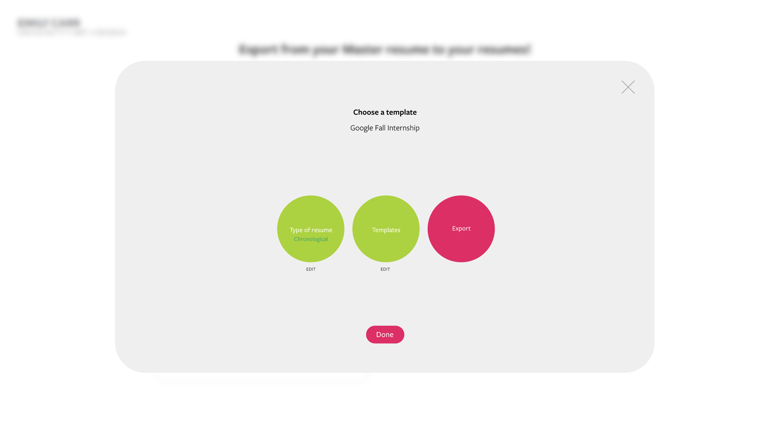
Students could then select the information they needed, choose a resume type and template, and create a more focused version for a specific opportunity.
Students may have useful experience spread across old resumes, application documents, portfolios, and personal notes.
When each opportunity requires a slightly different resume, deciding what to include can become stressful and repetitive.
The challenge was to create a process that helped students organize everything once, then move through clear decisions without turning resume building into another complicated design tool.
The solution was centred around a reusable master resume.
Students could start from scratch or upload an existing resume, organize their information into clear categories, and then use that information to build different resumes without re-entering everything each time.
The experience guided them through choosing a resume type, selecting a visual template, reviewing the information, and exporting or sharing the result.
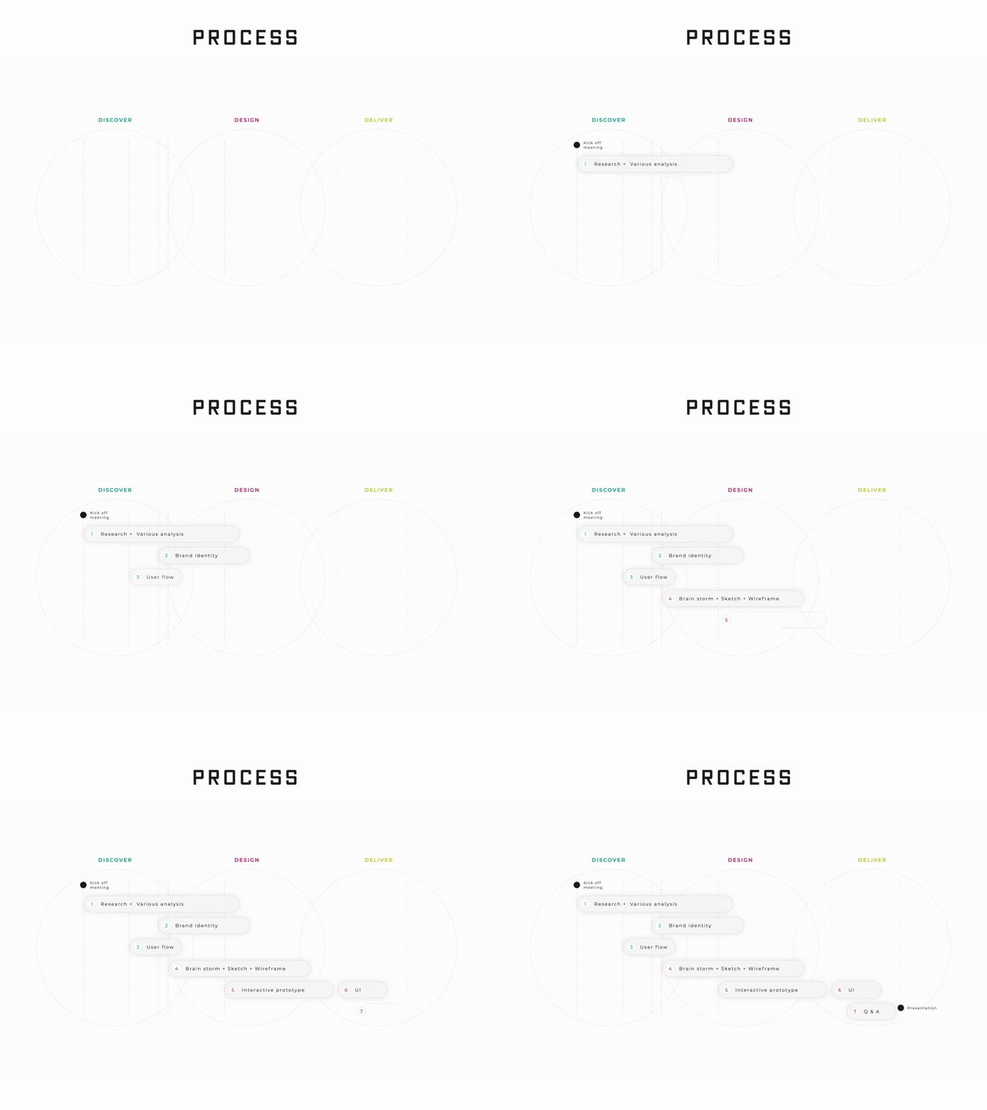
I mapped the experience from the Career Development Office homepage through to the final export.
The flow included two entry points: students could create a new master resume or upload an existing resume. From there, they could complete personal information, work experience, education, skills, honours, and certificates before selecting the type and appearance of the final resume.

I began with grayscale wireframes so I could focus on the workflow before adding the university’s visual identity.
The early screens explored how students would create their master resume, identify skills, choose a resume type, select a template, and review their information.
Keeping the wireframes visually quiet made it easier to evaluate the hierarchy and decide how much information should appear at each step.


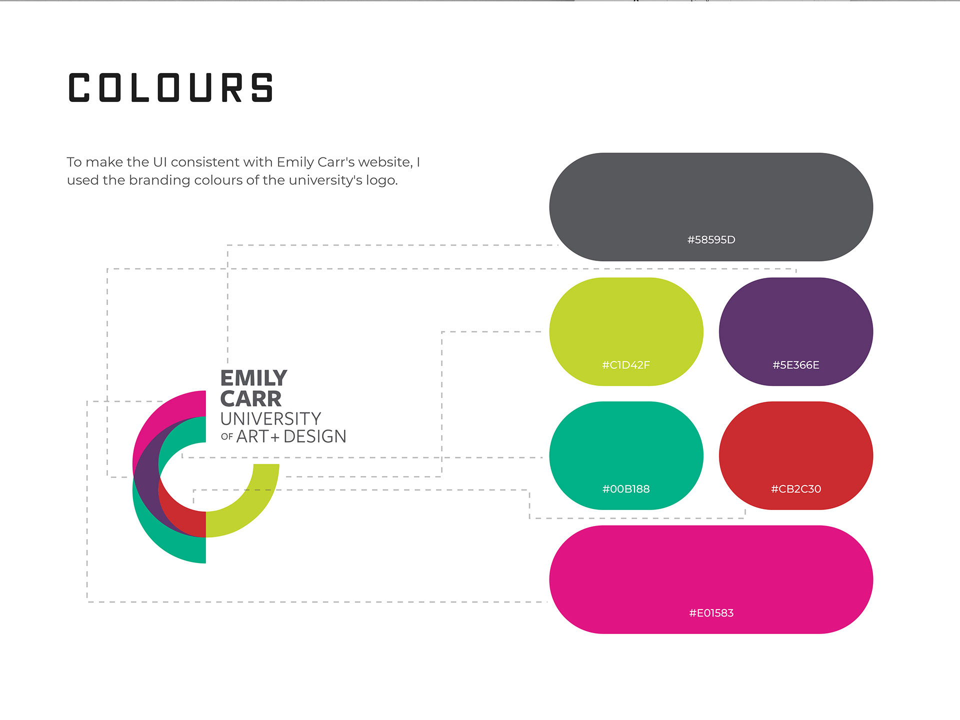
The Resume Builder was part of Emily Carr’s digital ecosystem, so it needed to feel connected to the university rather than like a separate product.
I built the UI palette from the colours in Emily Carr’s identity, using bright accents for selections, progress, and important actions while keeping most of the interface light and calm.
I used FreightSans Pro to create a clear and approachable hierarchy across the interface.
The typography needed to support longer instructions, form content, and decision-based screens without making the tool feel dense or academic.

From wireframes to an interactive prototype
The final interface translated the user flow into a guided, step-by-step experience.
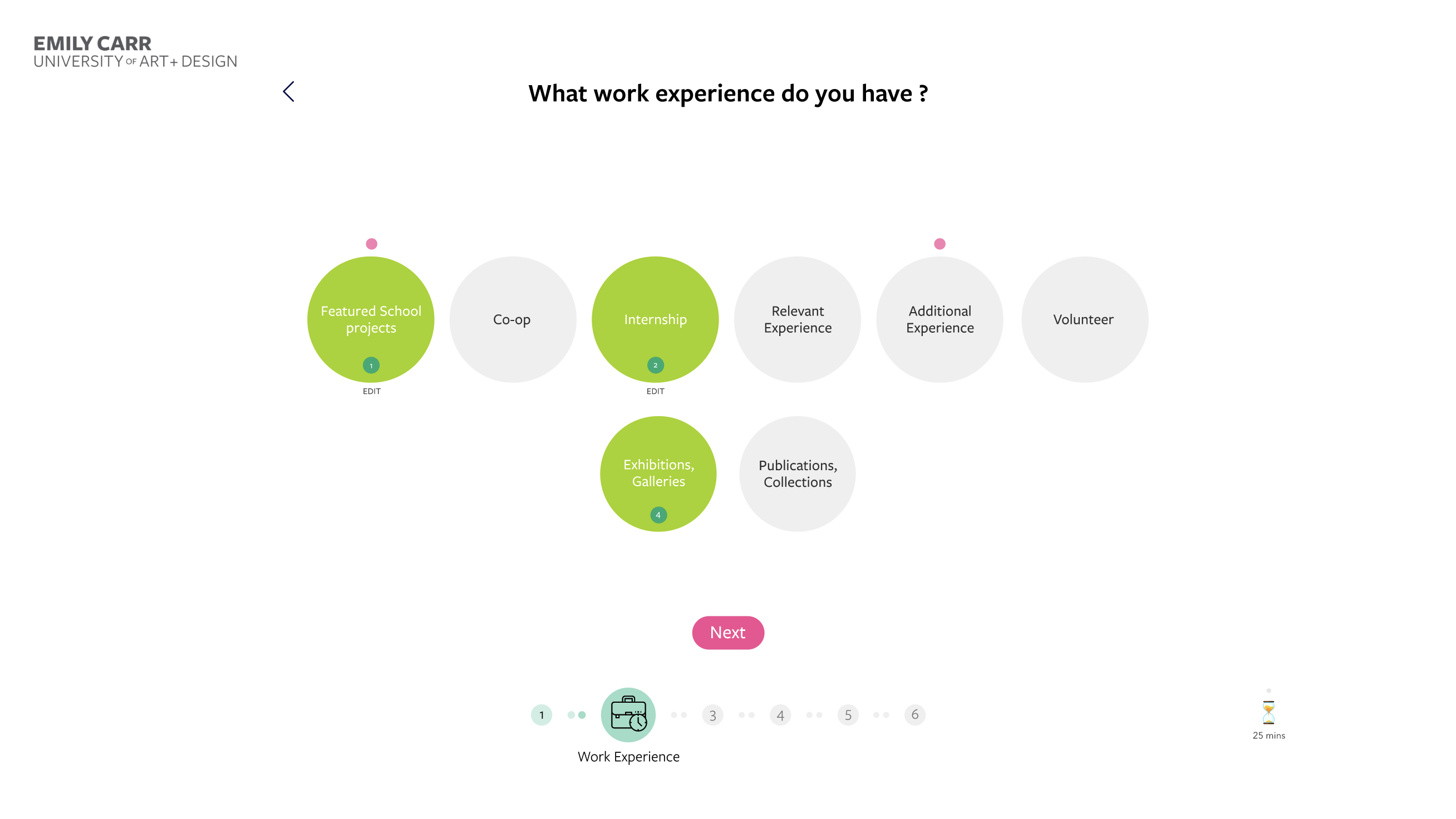
Large cards, circular selections, progress indicators, and focused modal windows helped break the process into smaller decisions. Students could concentrate on one part of their resume at a time without losing sight of their overall progress.

Explore the Resume Builder
This prototype shows how students move from their master resume to a tailored and export-ready document.
I designed a short animated introduction to explain the master-resume concept before students began.
It showed how information added once could later be reused across different resumes, helping the tool feel easier to understand from the start.

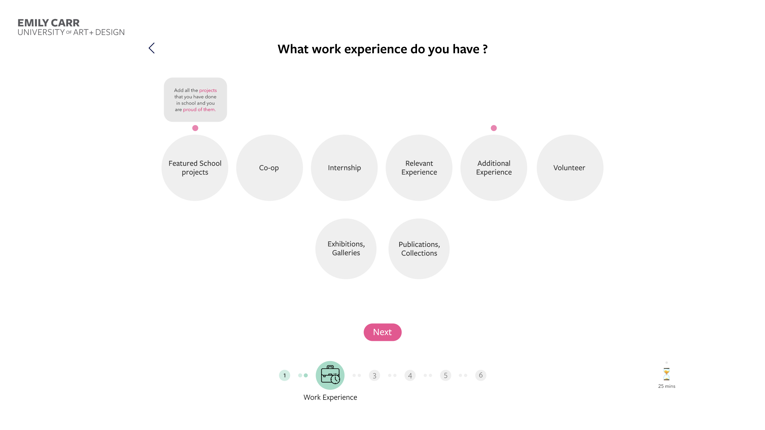
The experience divided resume content into manageable sections instead of presenting one long and intimidating form.
Students could add and review their information one category at a time.

Estimated completion times helped students understand how long each section might take before starting it.
This made the process feel more manageable and allowed students to plan their time instead of entering an open-ended form.

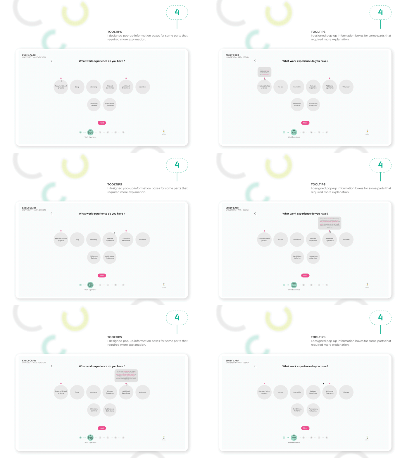
Contextual tooltips provided additional explanation when students encountered an unfamiliar term or decision.
The guidance stayed out of the way until it was needed, keeping the main interface clean and focused.
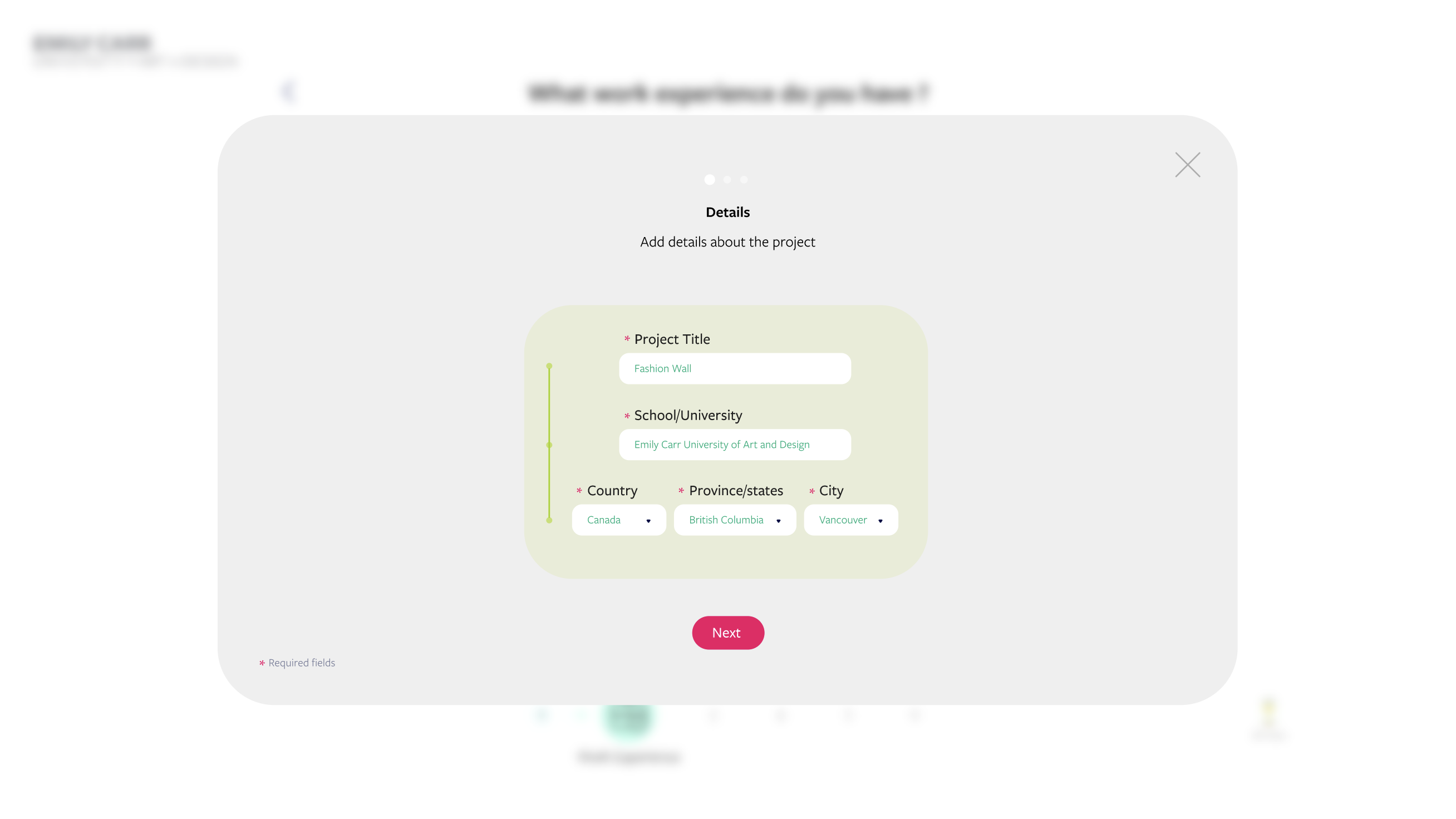
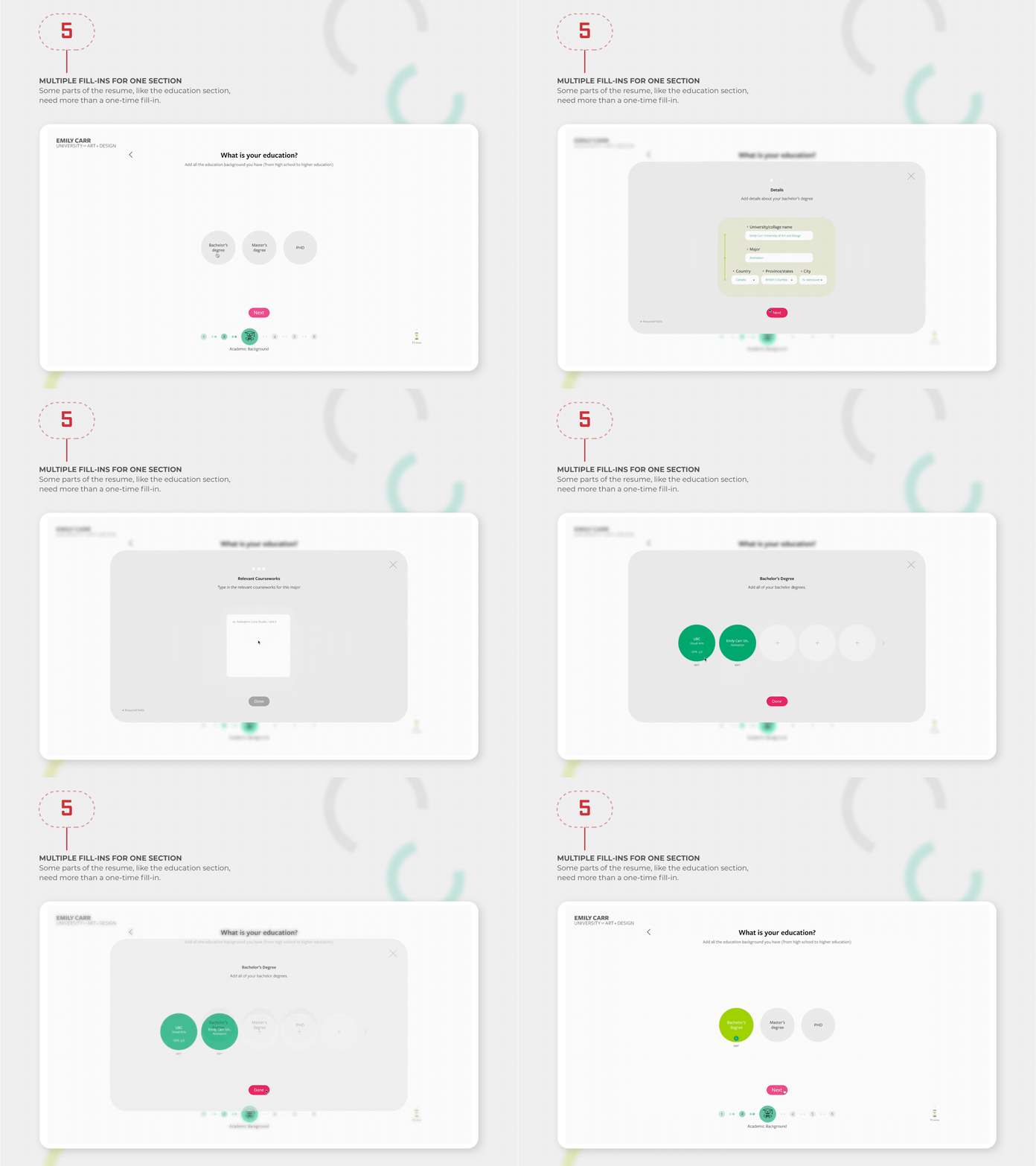
Sections such as education and work experience often require more than one entry.
Students could add multiple schools, roles, projects, or experiences without being limited to a single response for each category.
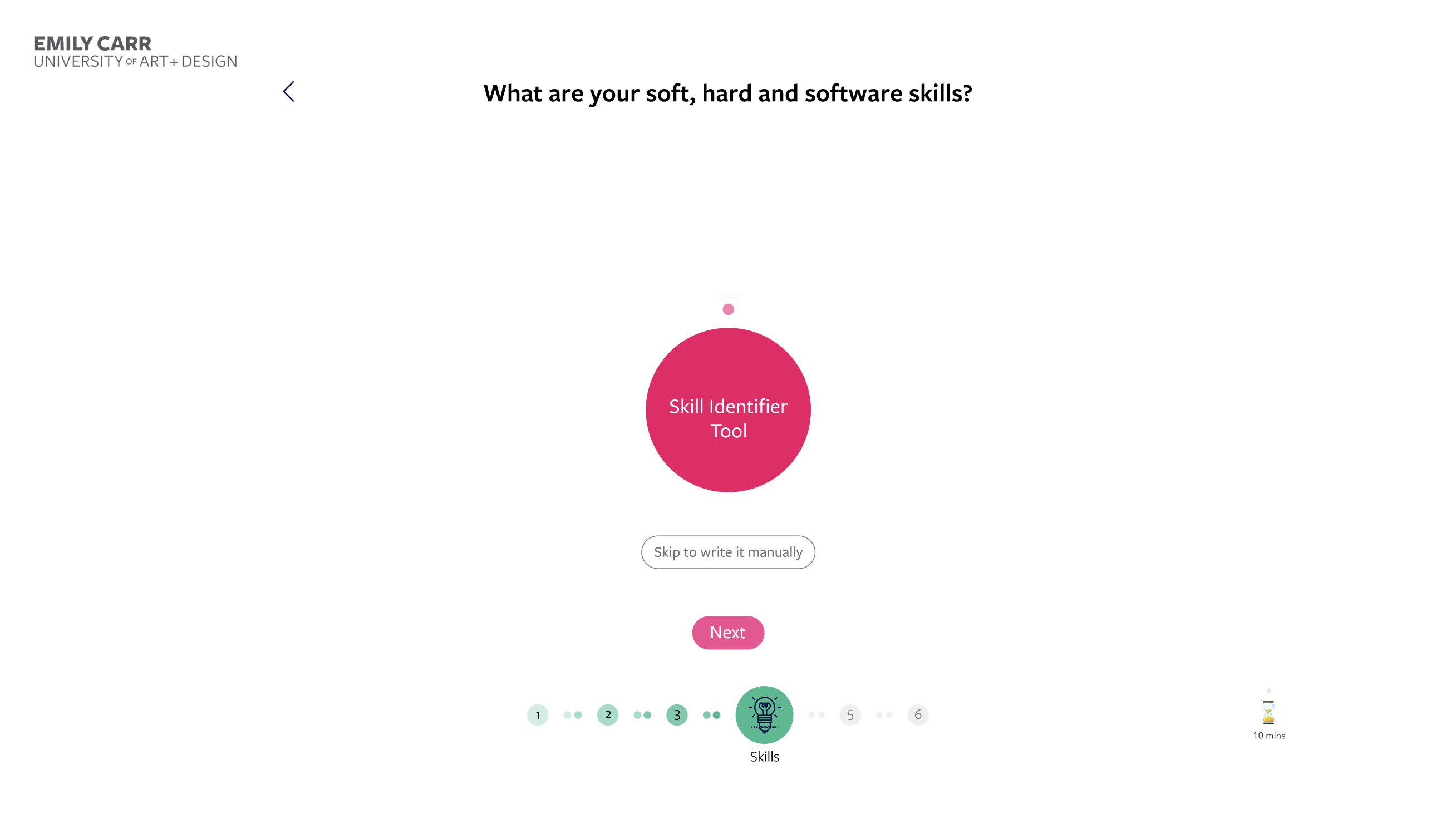
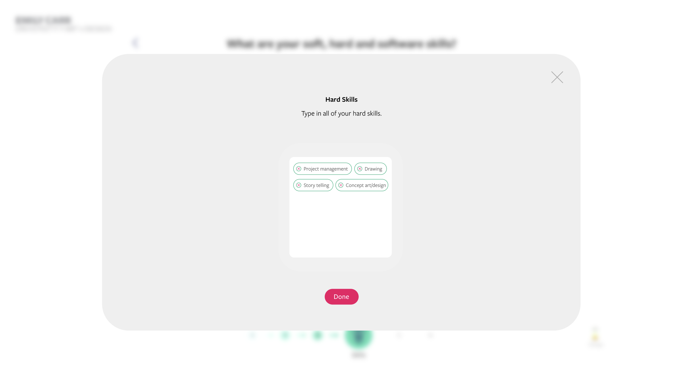
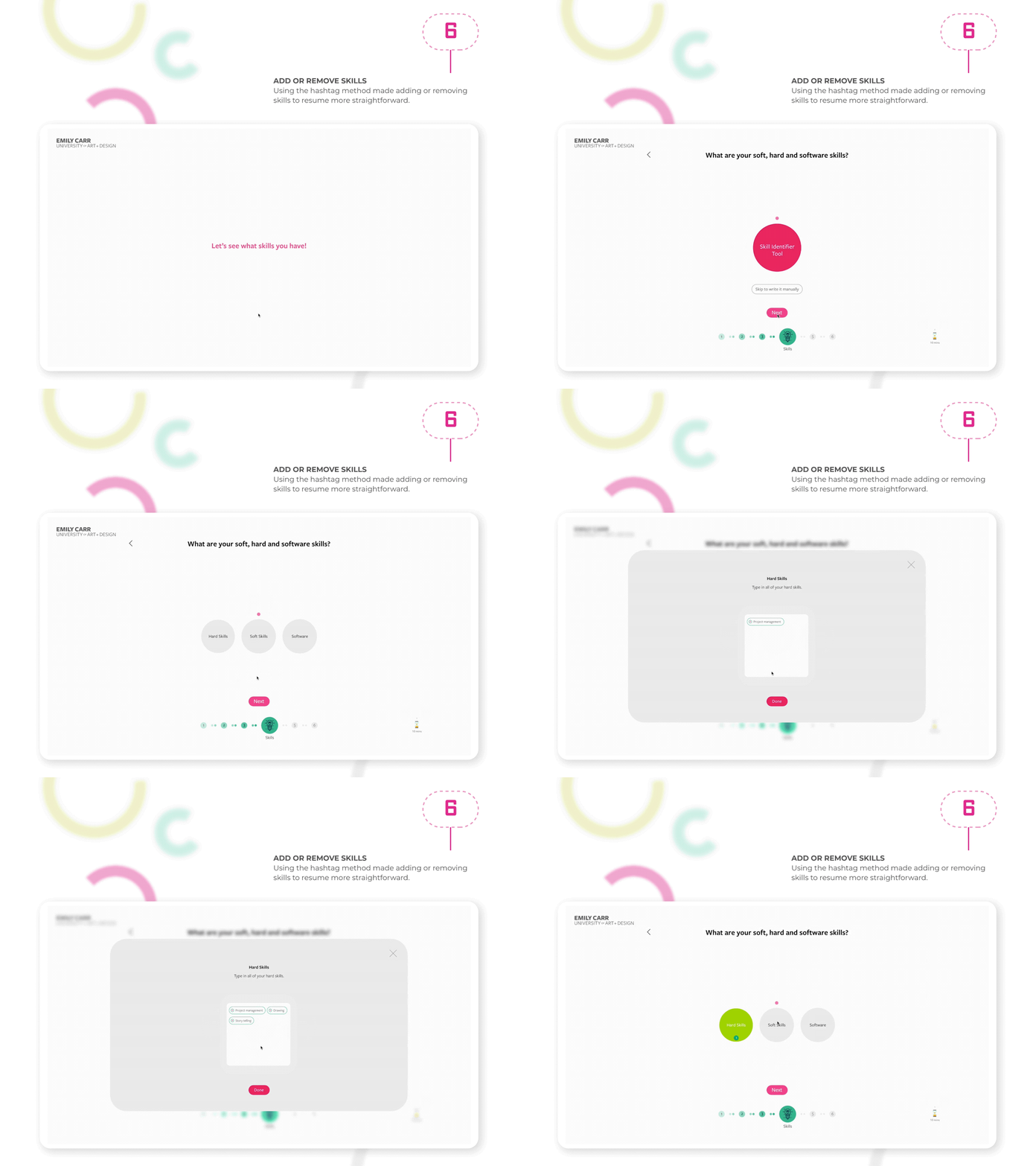
A tag-based interaction made it simple to add or remove skills from the master resume.
Students could build a flexible collection of abilities, then select the most relevant ones for each opportunity.
Once their master resume was complete, students could choose the experiences, education, skills, and achievements that matched a specific opportunity.
This turned resume creation into a focused selection process instead of asking them to start over every time.

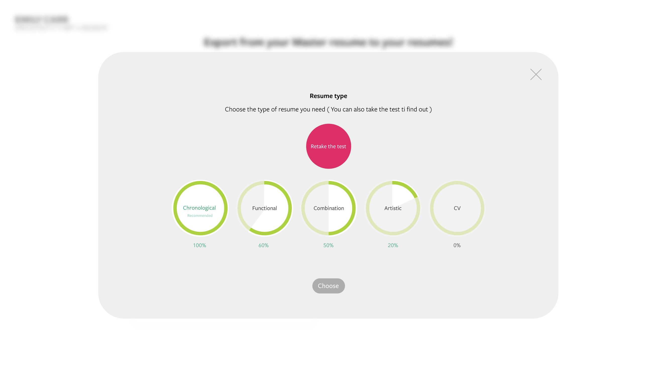
Testing showed that many students were unfamiliar with the differences between resume formats.
I designed a short quiz to help them choose between chronological, functional, combination, artistic, and CV formats, while still allowing experienced users to select a type directly.

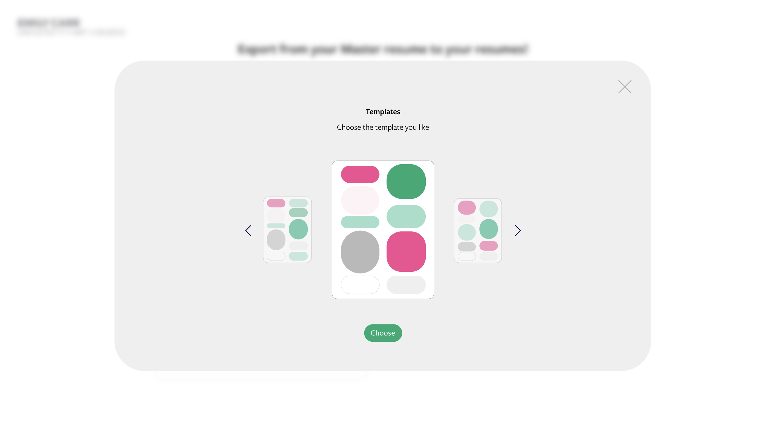
Students could compare visual templates and choose how their selected information would be presented.
This gave them control over the final look without introducing the complexity of a full layout editor.

When the resume was ready, students could export it as a PDF or editable document.
The finished resume remained saved in the web application, making it easy to update, adapt, and export again for future opportunities.

This project explored how the Career Development Office could turn a traditionally static resource into a more guided digital experience.
The master-resume concept was the most important part of the solution for me. Instead of treating every application as a completely new task, it gave students a foundation they could gradually build and reuse.
Working within Emily Carr’s existing identity also taught me how to introduce a new tool without making it feel disconnected from the organization behind it.